Daylight is a global design consultant. We have studios across San Francisco, Seoul and Munich. We help organization to discover, create and launch human-inspired products and services. As a full stack UX Designer at Daylight, I discovered and transformed raw, human-centered insights into viable business concepts and development-ready designs. Throughout my time at Daylight, I delivered innovative solutions and high-fidelity designs that led to several business opportunities. While most of my projects remain confidential due to client agreements, I hope to use this article to share glimpses of my time working as a Daylighter.
UX Designer
Full Time
Santa Clara County Housing Authority (SCCHA), LG Electronics, EarnIn, SL corporation, Hyundai
Jan, 2021 - Oct, 2024
I first joined Daylight at the peak of COVID-19. While it brought challenges, it also taught me resilience and adaptability as I transitioned to being a fully remote team member. Working at a design consultancy for the first time was a leap, but it allowed me to gain invaluable experience that I would like to share through the lens of my project experiences:
When solving a problem, there are always multiple layers of underlying causes, making it even more important to listen to everyone involved in the process. At Daylight, we had the advantage of being a third-party consultant, enabling us to better understand the situation by considering both our clients and their intended audiences.
When initially working with Santa Clara County Housing Authority (SCCHA) to address the public housing burden for tenants, Daylight and two other trusted partners came together to create Tenant Portal—a digital tool that allowed people to manage their housing information and documents online. While this tool proved highly helpful especially during the COVID-19 period, we realized part of the issue stemmed from the overwhelming workload and burnout experienced by housing specialists.
Tenant Portal — a digital tool to enable families to streamline their process of accessing housing assitance.
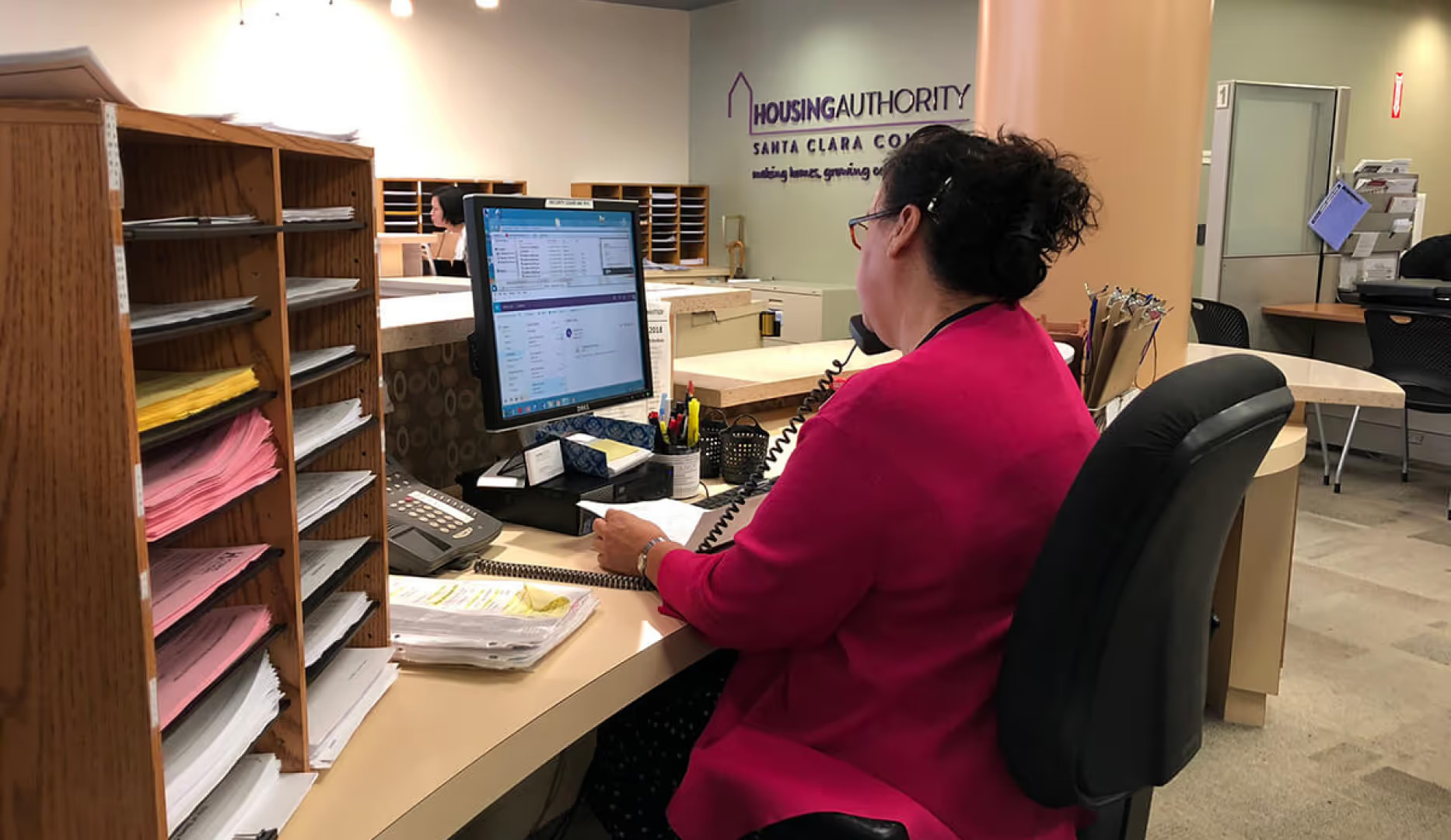
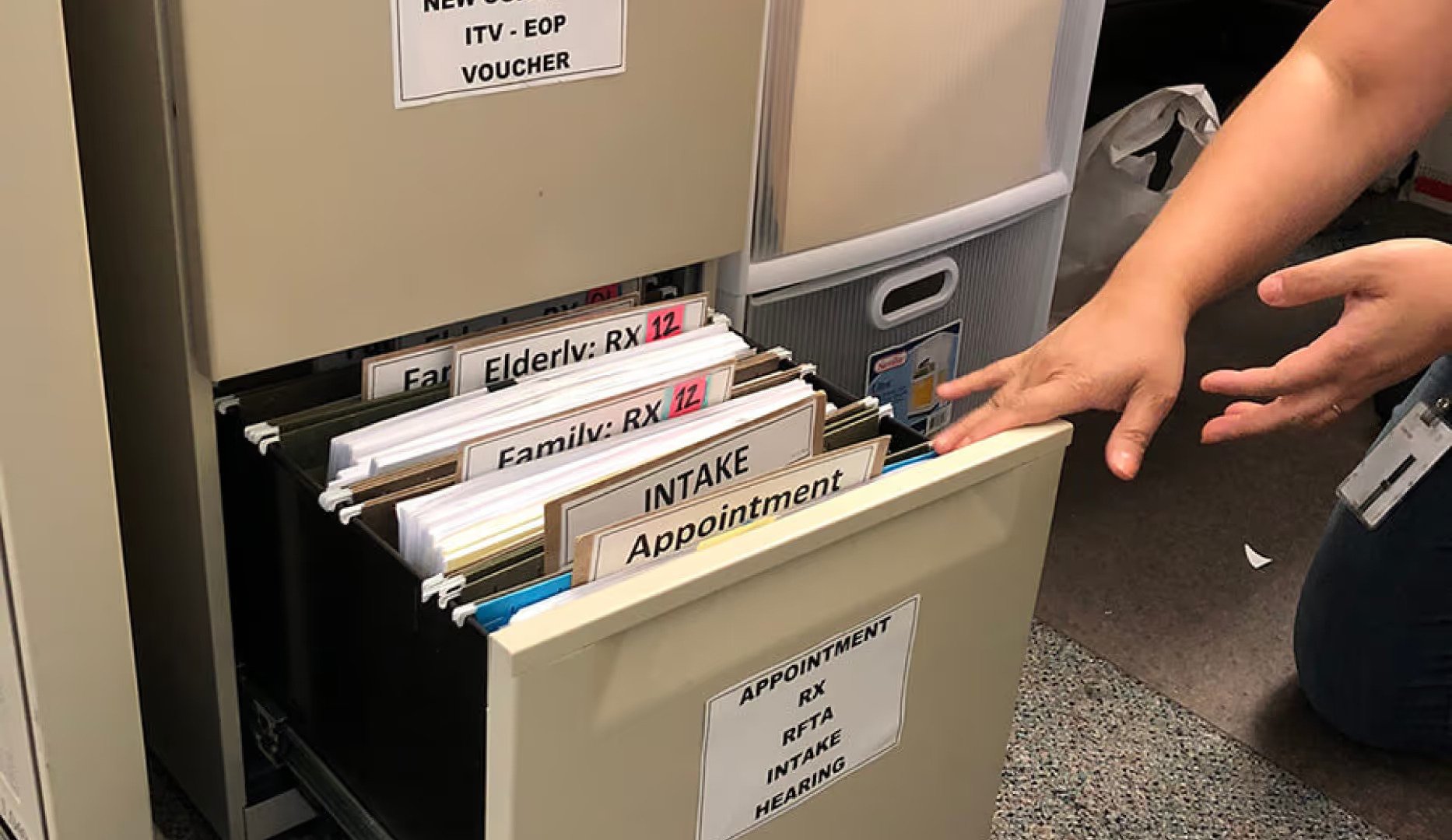
As we continued to improve Tenant Portal, we sought to streamline SCCHA’s internal administrative processes. We spent time talking to various housing specialists and assistants, studying their operating manuals, and mapping out each of their processes. Through this research, we discovered a lack of organization for requests and paper documents. As a result, we aimed to create a centralized task and document management system to help specialists stay on top of their workloads—an initiative we called Autumn
From our qualitative research, we know that specialists who are successful at their job often excel at organizing their tasks and documents. Thus, our goal was to enable everyone to do that through a digtial platform.
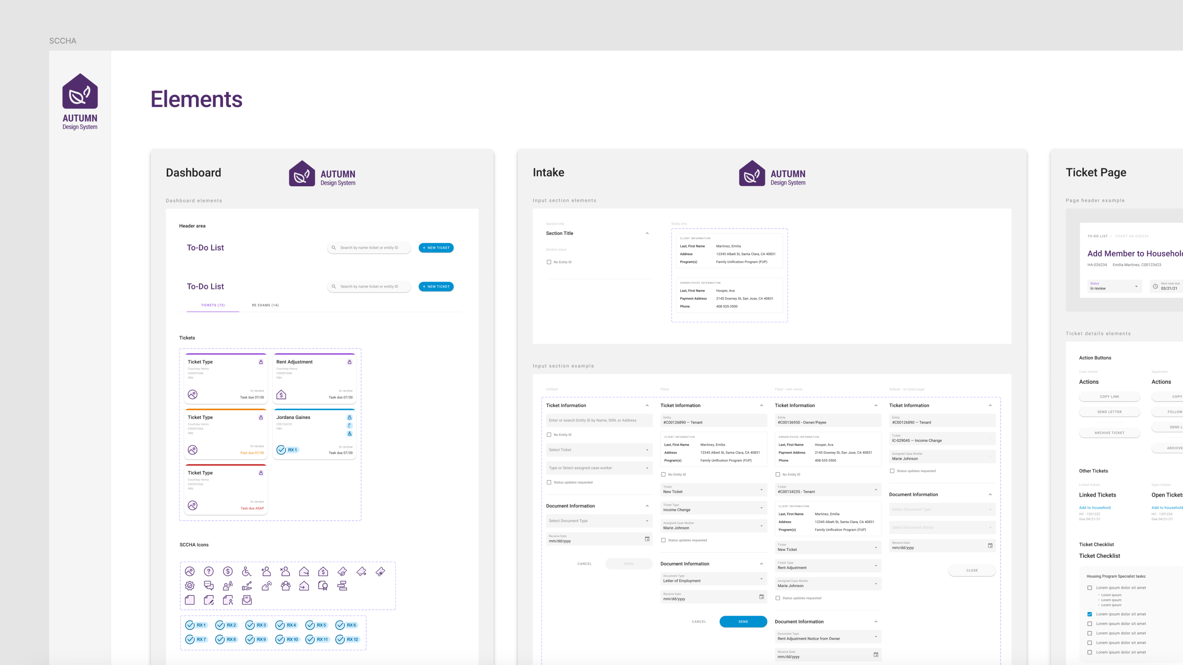
From our research, we discovered more than 20 processes, which would require hundreds of screens to capture them all. That’s when we decided to create a custom design system, dedicated to Autumn, to ensure consistency across all designs and to better facilitate the transition of their existing workflows into the digital world.
A custom design system I created to enable our team to build a consistent user experience for the different processes at SCCHA.
Below, is a snapshot of page templates I created to help streamline our design process. Throughout the project, we continued to iterate these templates based on the feedbacks from the specialists at SCCHA.
For interface that we use repeatatively throughout the workflows, templates are a great way to streamline our design process.
A major aspect of having a design system is creating custom components that capture the essence of how people operate in the real world. For the people at SCCHA, this meant a dashboard experience capable of organizing and managing all the tenant requests assigned to them. This required us to understand key information releveant to these cases and how they should be grouped and ordered.
From talking to the specialists, we learned that the type of transactions is the most important factor, followed by their individual urgency and due dates. From typography and iconography to visual hierarchy, I used these findings to refine my design and created custom ticket card and various dashboard templates with different grouping and ordering mechanisms.
Custom components like Tickets allowed us to tailor the user experience to how they actually work in the physical world.
Using the custom components, we created different templates to to test out their usability through real context.
Below is a page template for SCCHA's office assistant to intake new documents. With multi-layered components, I enabled other designers to swap out content as needed and efficiently build their workflows.
Multi-layered components enabled designers to swap content easily at different scales.
Upon accessing an individual ticket, we knew it was key to gather all the relevant information needed for case workers to perform their tasks. To achieve this, we incorporated a cloud-based system to store all documents and access key data from the government-regulated software named Elite. By centralizing this information in one place, we created a Ticket Page that includes Ticket Details, Entity Info, and an Activity Log, empowering specialists and assistants to process requests without needing to switch back and forth between other tools.
Ticket Page serves as the all-in-one place where case workers could access relevant document and information to process the ticket.
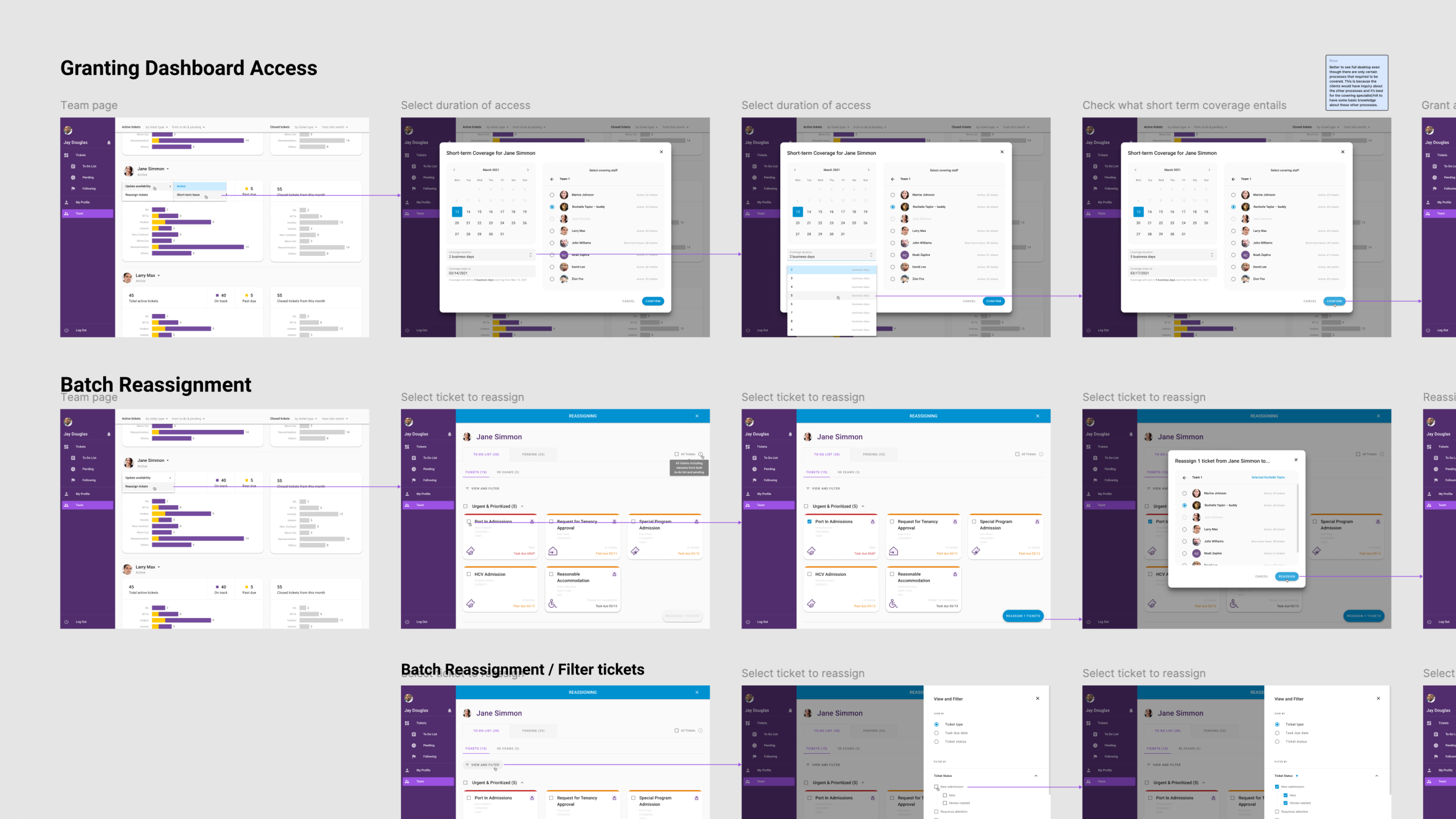
Using Autumn, we were able to create experiences that adapted to SCCHA's existing processes. By listening to all the stakeholders involved, our design considered each step, both within and outside the platform. From reassigning tickets among case workers to processing a denied request, we developed various user flows as well as interactive prototypes to demonstrate the experience but also ensure every step is in compliance to their prototcols.
Following SCCHA's coverage prototcol, I created an interactive prototype to demonstrate how supervisor could reassign cases for when staffs are out of office.
This is an example workflow of how a denial letter for a request gets processed. I mapped out the experience in details and included all the stakeholders' perspectives.
Above was just a few examples. With the use of our design system, we were able to transform countless more of their workflows into the digital world. The collaboration with SCCHA lasted for 11 months. The result was a MTP (Most Testable Product) version of Autumn along with a set of MVP designs to the client. If you'd like to learn more about the project, feel free to reach out!
Working as a consultant requires flexibility. Sometimes, it means taking on roles you may not be familiar with.
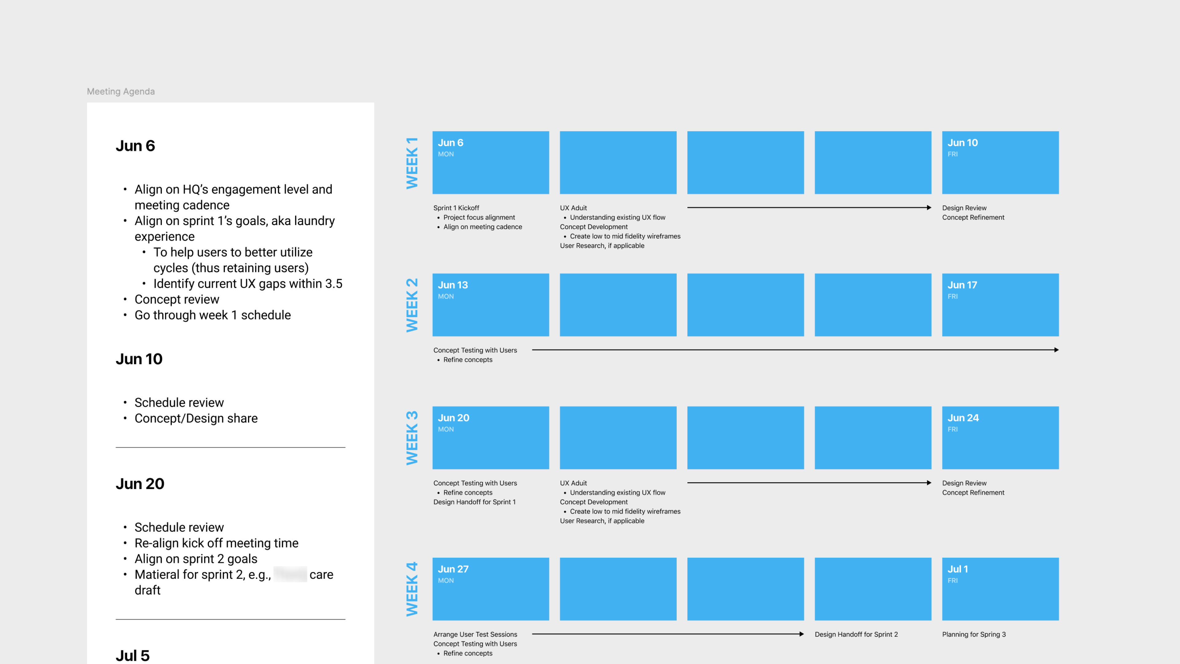
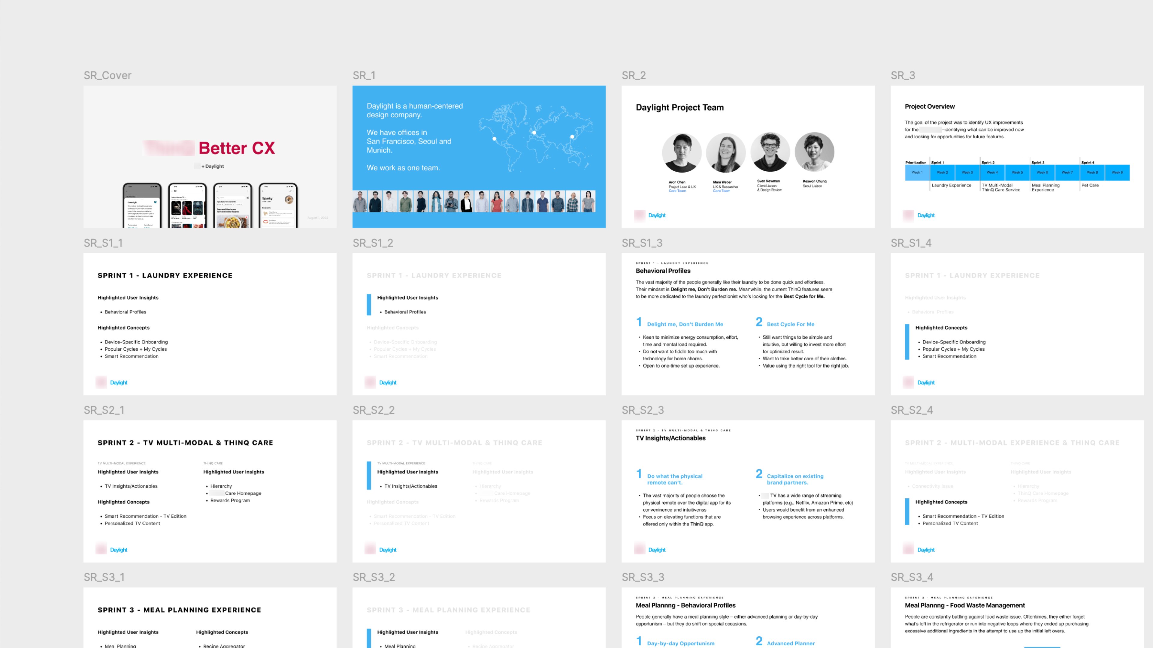
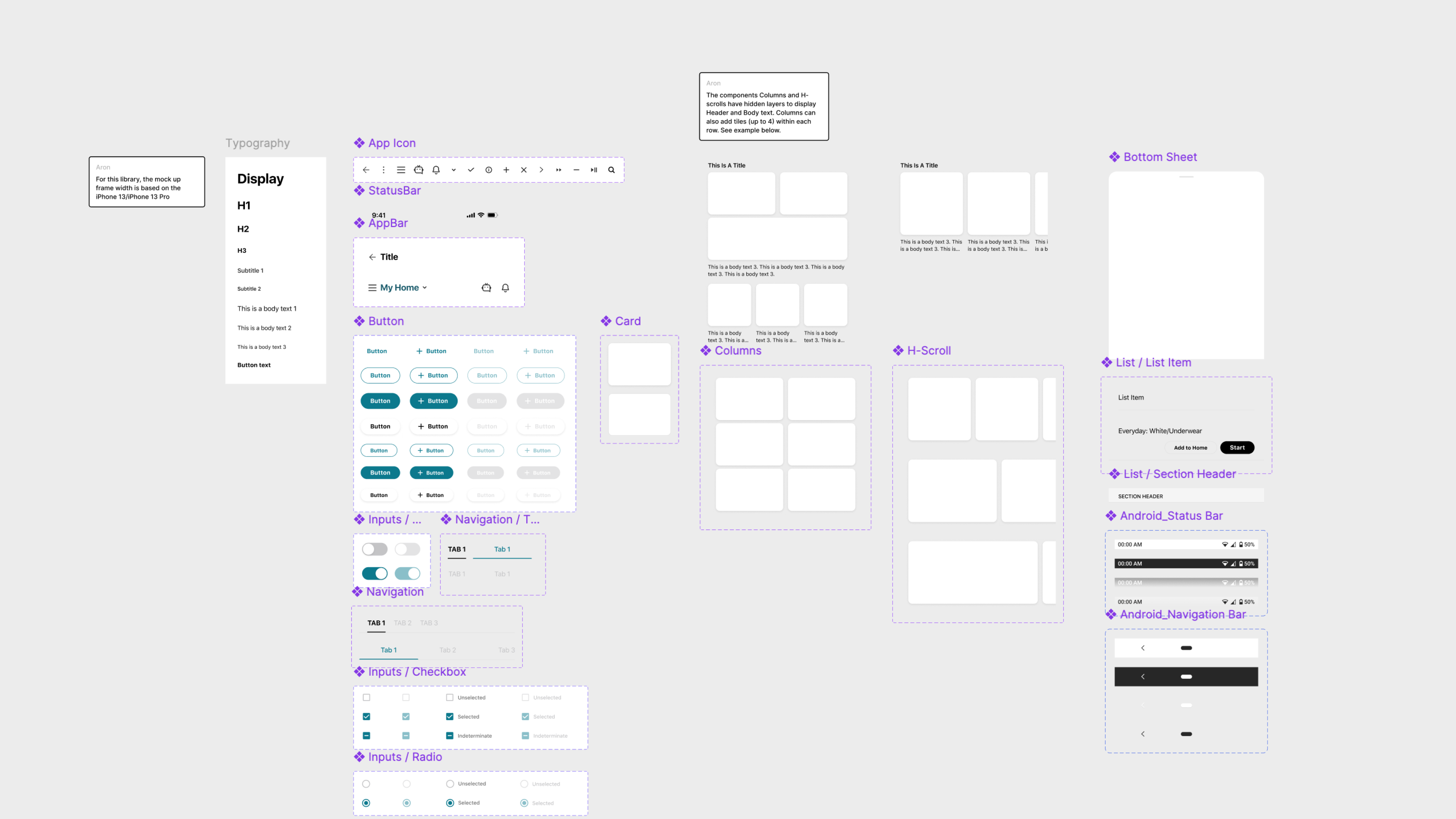
While working with a home appliance client, Daylight was tasked with improving user engagement with their app. Although I originally joined as an individual contributor, I eventually assumed additional role of project manager due to shifting resources. Throughout the project, I managed the sprint timeline, conducted user interviews, created a mock design system, and organized presentations to update the clients while fully participating in design execution.
From looking at the app analystics and interviewing the appliance owners, we learned that while people weren't against downloading the app, they found the app unhelpful and sometimes confusing in completing their housing chores, in comparison to just interact with the physical appliances, and ultimately decided to uninstall. To address the problem, our team set out to ideate for feature concepts that could bring value to the customers beyond the physical product themselves.
“I have no understanding at all of what’s on my phone and what’s over there [on the digital washer display]” — Anonymous appliance owner
By collaborating with the client and map out the full experience, this gave us an understanding on the architecture and the features available within the app. This helps us to come up with ideas that can seamlessly integrate into the existing ecosystem.
Original flow map on the app navigation.
By speaking to real appliance owners and understanding our client’s app, we delivered a set of feature concepts tailored to individual home appliances. For example, we learned that the app provides many downloadable cycles (e.g., Overnight Wash) that could benefit users’ laundry needs, but the app’s user experience made accessing these potentially useful features daunting and often too cumbersome for users to explore. To address this, we revamped the device page to present a simulated dial experience that mirrors the physical device's dial control. We also simplified the cycle list by prioritizing popular cycles and recommending cycles based on user routines.
Feedback from our initial testing session with home appliance owners.
Reorganized device page to surface favourite and popular cycles to download. The More button for progressive reveal and prevent information overload.
Instead of showing all cycles which most won't be useful, show the most relevant ones by studying user's routine.
Another major insight we learned was that users had trouble understanding the benefits available only through the mobile app. For instance, an owner with multiple products from the client mentioned, "I have the oven, but I don’t use the app because who needs an app for an oven?" Part of the issue was the lack of an onboarding experience. Therefore, we proposed introducing a series of device-specific onboarding screens when a new device is connected to the app.
Once the device gets connected to the owner's phone, the app will initate an onboarding experience showcasing all the exclusive benefit of using the app.
To ensure feasibility, we incorporated these new designs into a flow map to showcase how users would access and navigate them. On top of that, we conducted additional ad-hoc user testing sessions to further refine our designs.
Besides the examples above, we developed many other concepts for various appliances. The project led to an improved app experience with a clear value proposition for appliance owners. For Daylight, it resulted in several follow-up business opportunities with the client, and I was proud to play a key role in these successes.
One of the most fascinating aspects of working as a consultant is the opportunity to collaborate with clients from various industries. This diversity requires us to quickly learn and adapt, but at same time, we got to leverage our outsider perspective to explore novel ideas and challenge our creative boundaries.
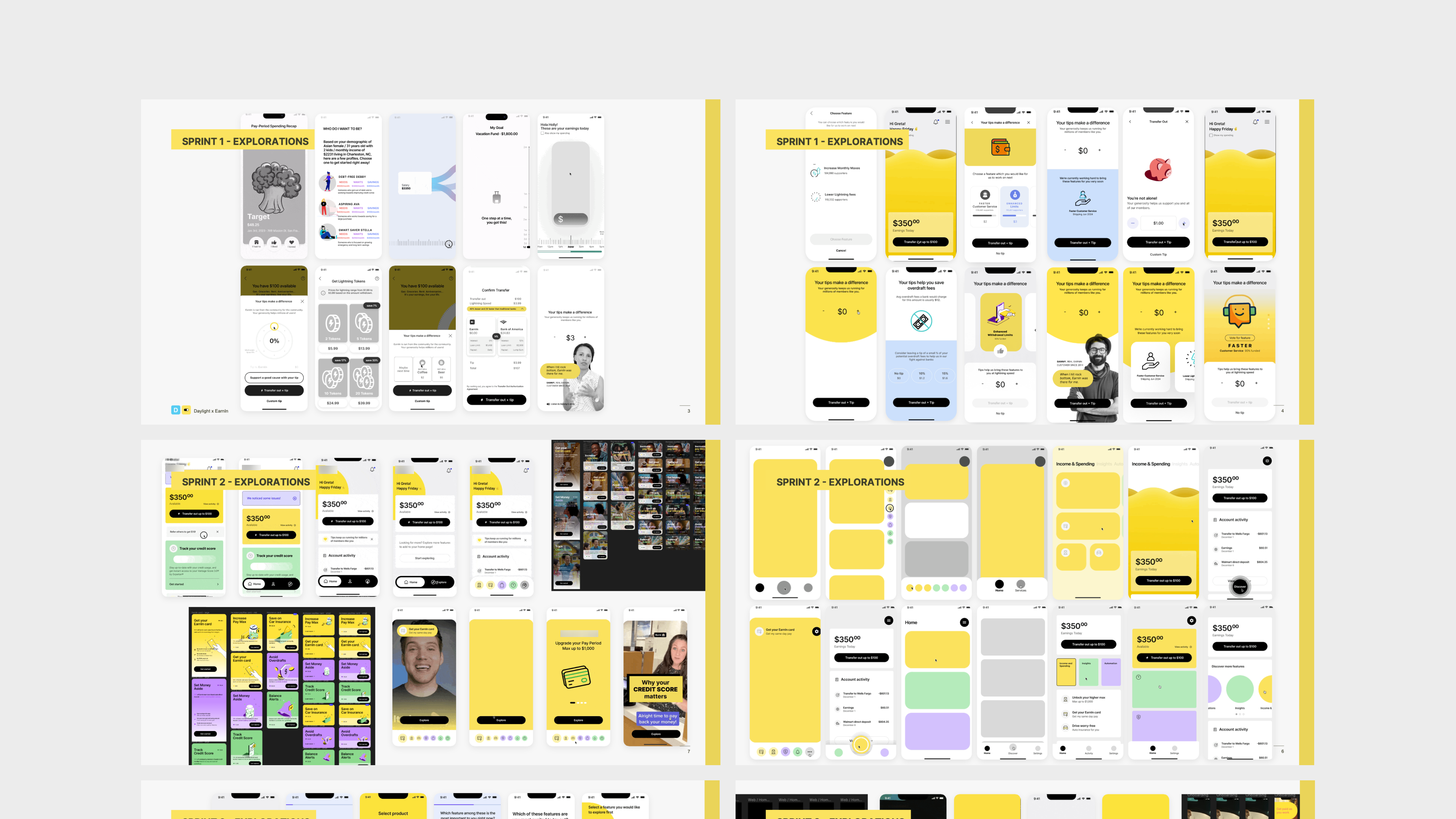
While working with a financial services company, we needed to understand concept of Earned Wage Access (EWA), as well as the functionality of our client's mobile app, their design system, and the ecosystem in which they operated in. Despite a rapid schedule of sprints, we managed to deliver innovative, high-fidelity designs with precision. We achieved this by exploring an abundance of ideas and rapid prototyping.
To achieve the best results, we often explore a wide range of ideas.
While I cannot show the actual deliverables due to confidentiality, I created a mock concept to provide a glimpse of our thinking and considerations while collaborating with the client. With the goal of helping customers better manage their finances, our team was tasked with creating visualizations to represent a customer's financial state by showcasing their recurring earnings and expenses. Considering usability factors such as spending categories and time spanning past and future, we worked with our client to craft a feature experience that is both functional and captivating.
From the client, we learned that customers often have a certain amount of recurring earnings and expenses that can be projected. Our goal was to visualize this information and showcase how their live income could cover their expenses due in the upcoming weeks. We aimed to create an interface that clearly communicates the relationship between these entities and their associated information. To accomplish this, we experimented with different shapes, colors, and motion design—techniques I demonstrate within the mock concept below.
In the mock concept, I opted for an initial loading oval that later diverges into categories representing income and expenses, illustrating their connected relationship. To prevent information overload, users can view the overarching summary before drilling down into individual bills.
While these bill details can be automatically determined by analyzing the user's past bill history, we ensured they could also be manually adjusted. In addition, we recognized that not all bills have the same priority level, so we introduced another ordering mechanism that allows users to label their bills and see how prioritized bills are being covered compared to covering them by due dates.
Users can click on individaul bill to edit details and access relevant actions.
While most people pay their bills by due dates, some are more important than others (e.g., rent). Therefore, we included an additional sorting mechanism to reorder and prioritize expenses based on bill importance as determined by the users.
While the examples above are self-made mockups, it is that same level of detail and prototyping proficiency that won our client over. On top of that, our team consistently demonstrated a willingness to think outside the box and challenge our creativity. Below are some concepts we explored during the sprint. While we ultimately decided to move away from these concepts, it was not without a relentless effort to push the boundaries of these designs before opting for other options.
The ring design option lacked the ability to show people their overal financial status at a glance.
While the isometric design had an incredible novelty feel, the concept was short of clear usability and readbility for the users.
The project was originally set to be 3 months, but with our constant high level of output— exceeding our client's expectation, they decided to extend the contract and continue our partnership.
Explore other projects I've done at Daylight:
While I joined Daylight with a specialized background in UX/UI design, I stepped out of my comfort zone and explored other roles such as research, project management, and client relations. Each position taught me how to create impact in ways beyond my typical design work. Additionally, I learned how different types of clients and projects could produce a variety of outcomes. Whether it was a grand product concept or a subtle UX improvement, opportunities to make a difference never ceased to exist. These experiences would not have been possible without practicing as a full-stack UX designer at a consultancy like Daylight. Being a Daylighter is an experience I will cherish for years to come.
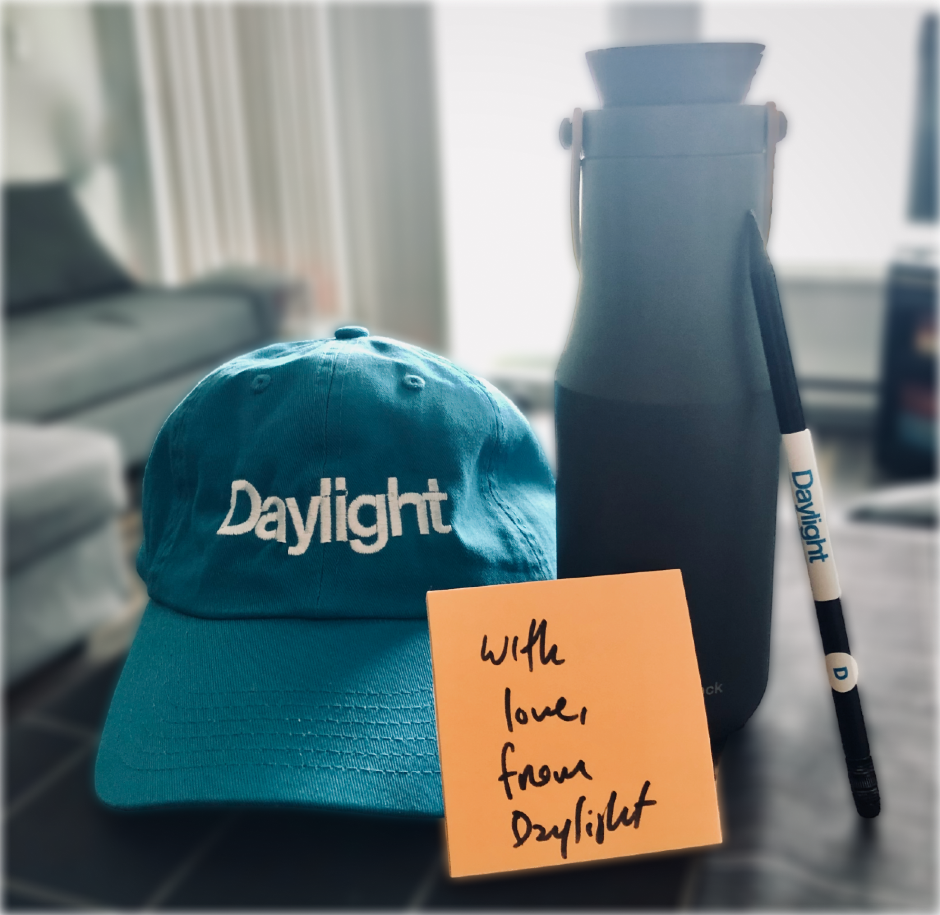
My welcoming kit. With love, from Daylight.