

Inclusive Postpartum Care is a mobile web platform that acts as a springboard for new, urban, low-income parents to access relevant information and services for postpartum care. It was a project that my team and I had developed throughout the course: IAT 499 Graduation Project where students are expected to engage into a complex topic and construct their own solution in helping to resolve the issue.
How might we support new, urban, low-income parents who may be experiencing or might be at risk for postpartum depression in seeking professional help?
As the lead UX designer, I was responsible of mapping out the user flow, making high-fidelity mockups, and creating interactive prototypes. I also contributed to user research as well as concept ideation.
The Vancouver User Experience Awards — UX By Student Finalist, People's Choice
Gabriel Yeung, Venus Lau
Adobe Illustrator, Adobe Premiere, Sketch, Principle, Keynotes
Case Study
10 Weeks (Spring 2018)
Postpartum depression (PPD) is a mood disorder that affects 10-15% of birthing persons during or after pregnancy. Symptoms of PPD include uncontrollable crying, feeling worthless or guilty, and not being able to bond with their baby. For the parents, untreated postpartum depression could potentially develop into chronic or recurrent depression. For their children, it can contribute to emotional, behavioural, cognitive, and interpersonal problems in later life. (Stuart-Parrigon, Stuart, 2016)
Despite the adverse effects of untreated postpartum depression, the American Psychiatric Association explains that “only 15% of [birthing persons affected by postpartum depression] seek professional help (Postpartum Progress, n.d.).”

In the early phase the project, we first conducted secondary research through reading news, journal articles and other online forums. By doing that, it helped us in identifying our target population as well as their barriers to receiving help.
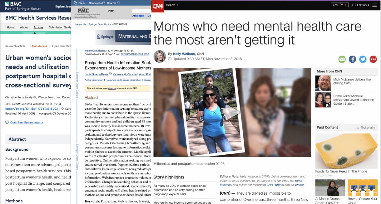
Based on the research, our team decided to further focus the project on new, urban, low-income parents since it revealed to us that this population has a much higher prevalence of postpartum depression- around two times more likely.
“[Socioeconomically disadvantaged parents] experience higher rates of postpartum depression, with reported rates between 22% and 30% compared to 13% overall in the general population."
“The prevalence of postpartum depression was higher among [parents] living in urban areas than among those living in rural, semirural or semiurban areas."


As part of our research, we’d also identified and listed barriers, which may inhibit new, urban, low-income parents from engaging with postpartum depression services. Through team discussions, we then synthesized these barriers into three overarching barriers:
Personal barriers
Systemic barriers
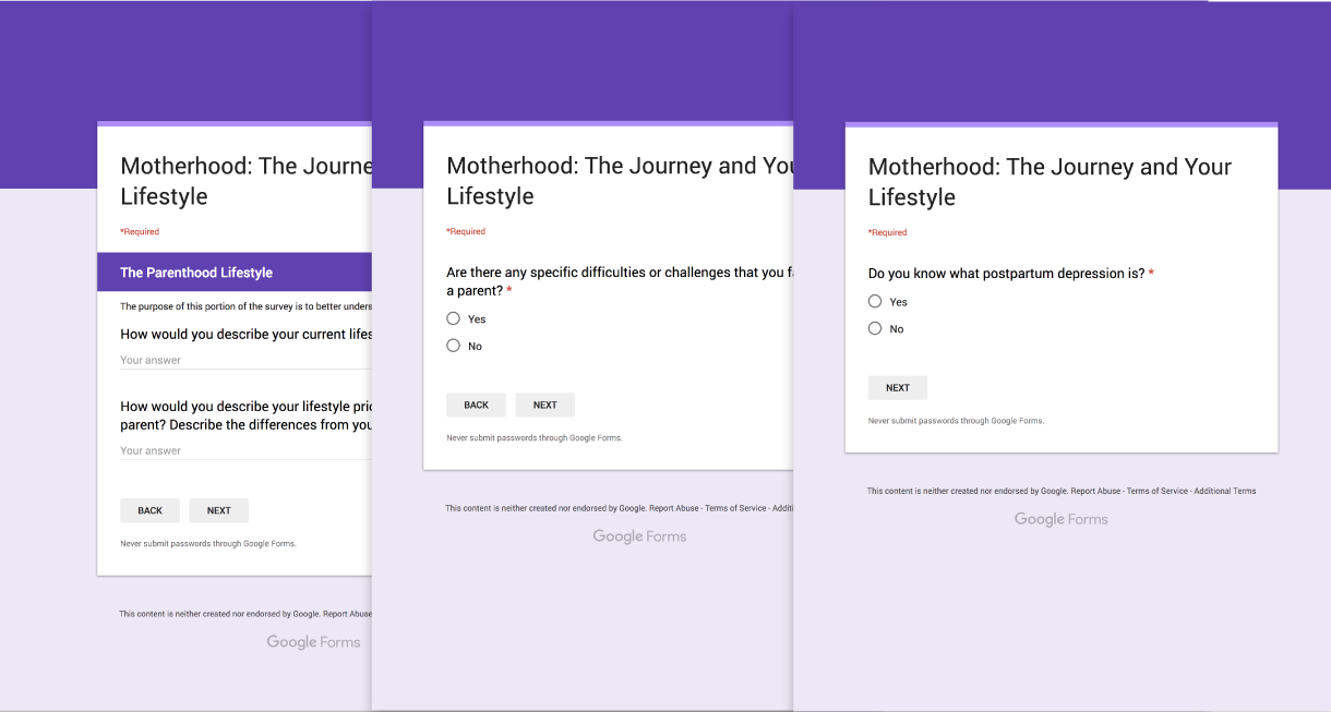
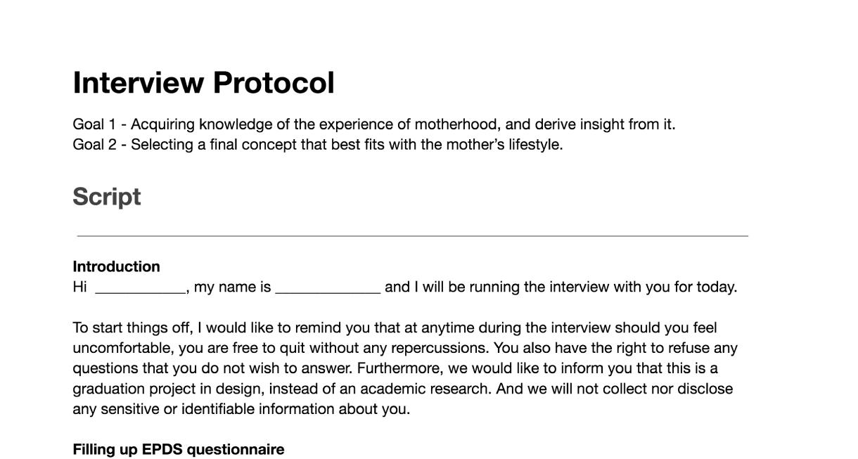
After acquiring the scope of our project, we then followed an informed consent protocol and did some primary research with six new parents through online surveys to gauge their awareness of postpartum depression and to better understand their postpartum experiences.
Throughout the middle and later stage of the project, our team also talked to different professionals including a family physician, social worker, and financial advisor to get a more in-depth view of this population’s life, to prove our concept, and to provide feedback and insights based on their professional experiences.
To support new, urban, low-income parents from accessing postpartum services, we studied different mediums and channels that this population may interact with such as social media platforms like Facebook and a dedicated mobile app.
However, from our research, we learned that this population has the pre-existing practice to access the internet through their smartphones to search for information regarding health and childcare. We also determined that this occurred over a short burst of time, for 10-15 min per day. For these reasons, we’d decided to not only focus on leveraging the internet but also to have our intervention resides on mobile.
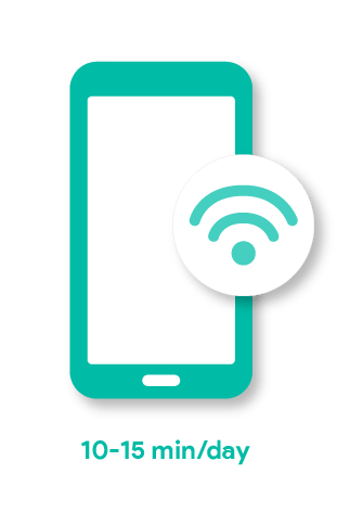
Pre-existing practices of searching health related information
We looked into existing sources found on mobile regarding postpartum care, and surfaced these key barriers that stopped new, urban, low-income parents from seeking for the information they need:
This then brought us to ask, how might we facilitate the information-seeking process so that new, urban, low-income parents are better able to find postpartum information in a timely manner?
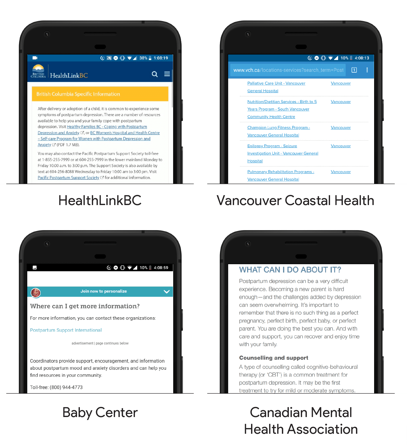
Example of existing sources regarding postpartum care
With the aim to help supporting new, urban, low-income parents in accessing information regarding postpartum care, we proposed a platform which leverages the Google Knowledge Graph to surface information about postpartum depression from credible sources and connects them to relevant services. Through the use of our intervention, we hope to guide them into seeking and receiving professional help as they may be in need.
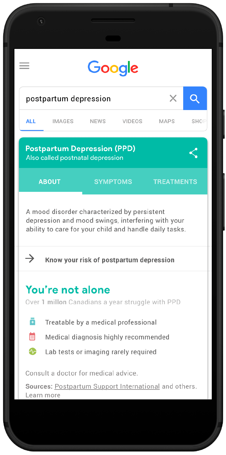
Google Postpartum Care
We decided to use Google as the platform for the intervention since mobile search already happens for our users. This improves the chances of long-term adoption in comparison to a dedicated app and also gives a more seamless entry fitting with their pre-existing practices.
Google Search Engine
Google’s Knowledge Graph (a.k.a. Health Cards) is a knowledge base that has been widely successful in refining search results and removing the need to click through websites by pulling information directly from credible sources. It is particularly beneficial for our users who have little time to do research. Thus we wanted to base our intervention on this framework.
“The Knowledge Graph eliminates the need for users to click through to websites."
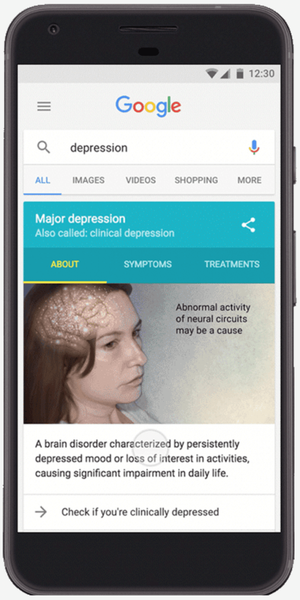
Google Knowledge Graph
Google has also collaborated with the National Alliance on Mental Illness to present the PHQ-9 depression screening questionnaire in the Knowledge Graph for depression. Screening tools like the PHQ-9 are important because “Awareness about depression can help users in identifying it and getting help faster.”
“We hope that by making this information available on Google, more people will become aware of depression and seek treatment to recover and improve their quality of life."
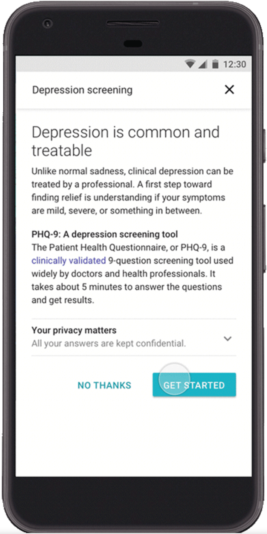
PHQ-9 Mental Screening Tool on Google
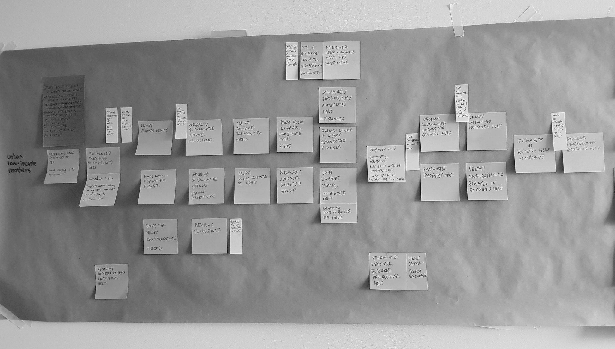
We created an experience map to identify how our users may navigate through the intervention. We also ideated for different features and implemented throughout our intervention that later got divided into five distinct stages: Discover, Learn, Assess, Seek, and Save.
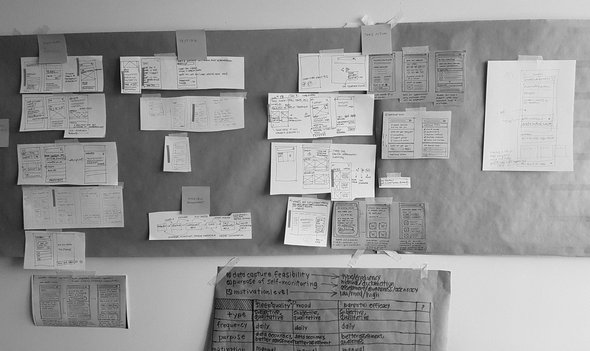
After deciding on some of the core features to be implemented throughout our intervention, we began to research and sketch for various forms that are best suited for this integration.
Upon deciding on the concept we wanted to pursue, I was responsible to make low fidelity wireframes in order to bring the user flow our team had in mind to life. This process allowed us to evaluate on the project concept and gave us the capability to quickly pivot if we needed to.
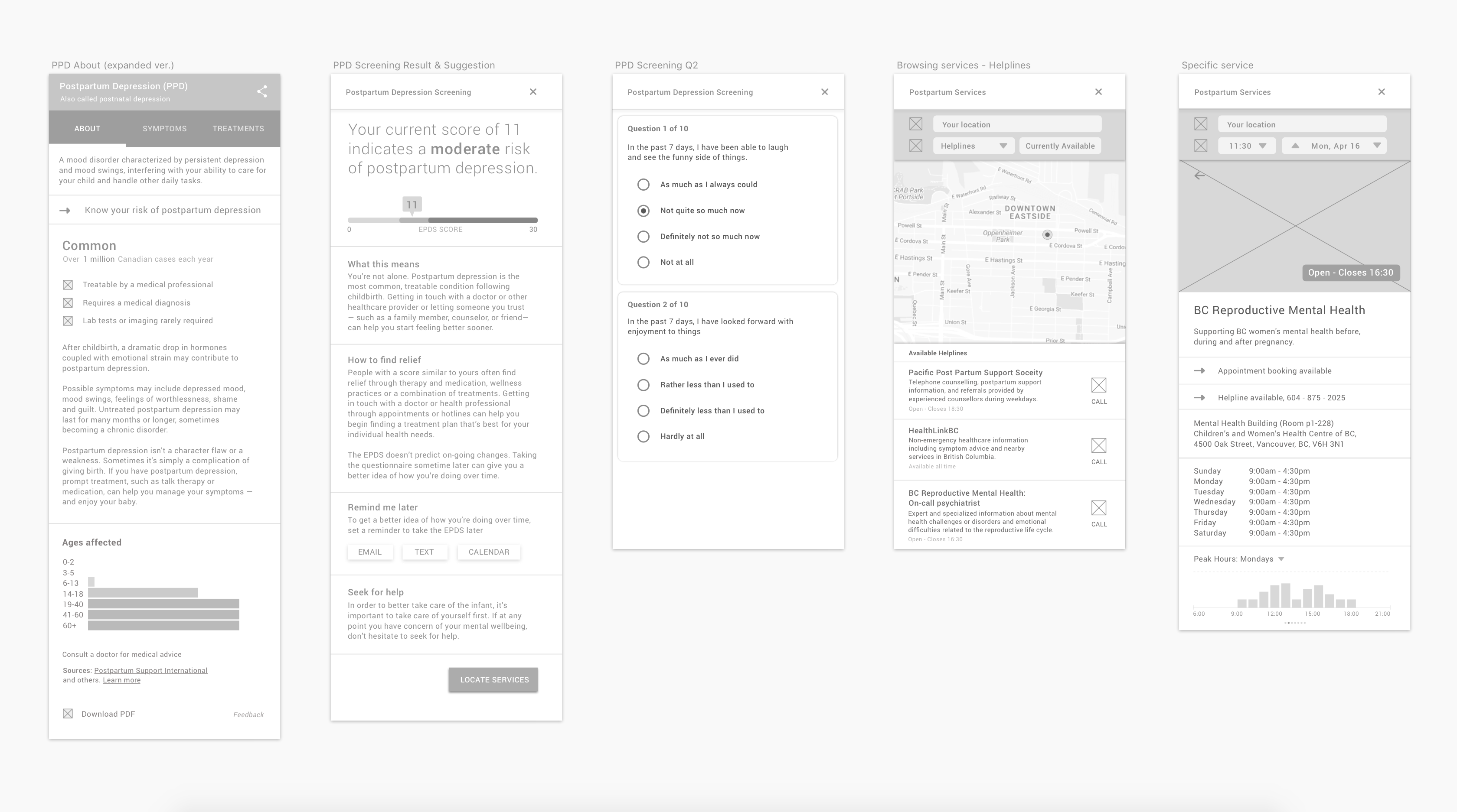
After the initial evaluation on the wireframes, we further refined our design into mid fidelity mockups with the addition of colour and some improved UI decision. For instance, we decided to surface the filtering options from our Seek Help feature.
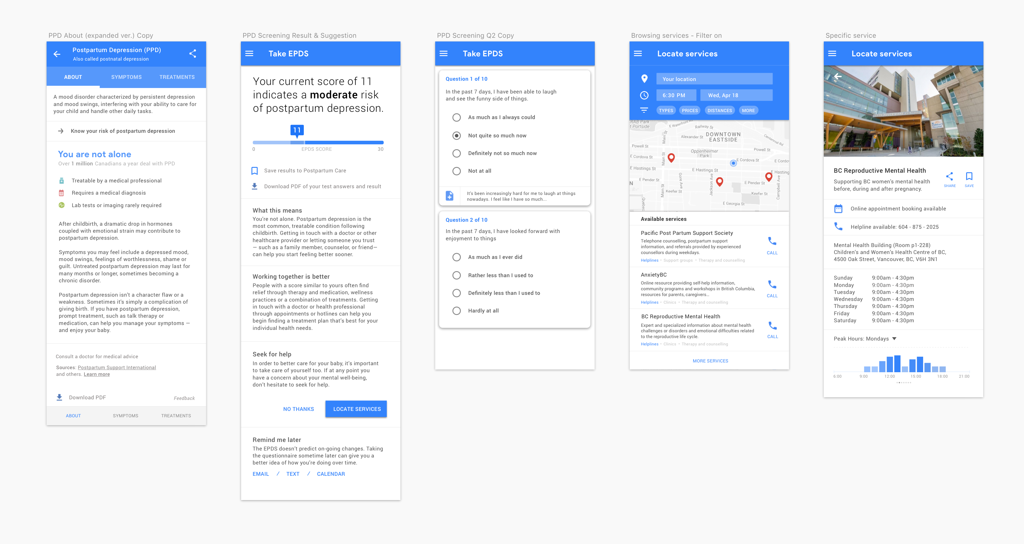
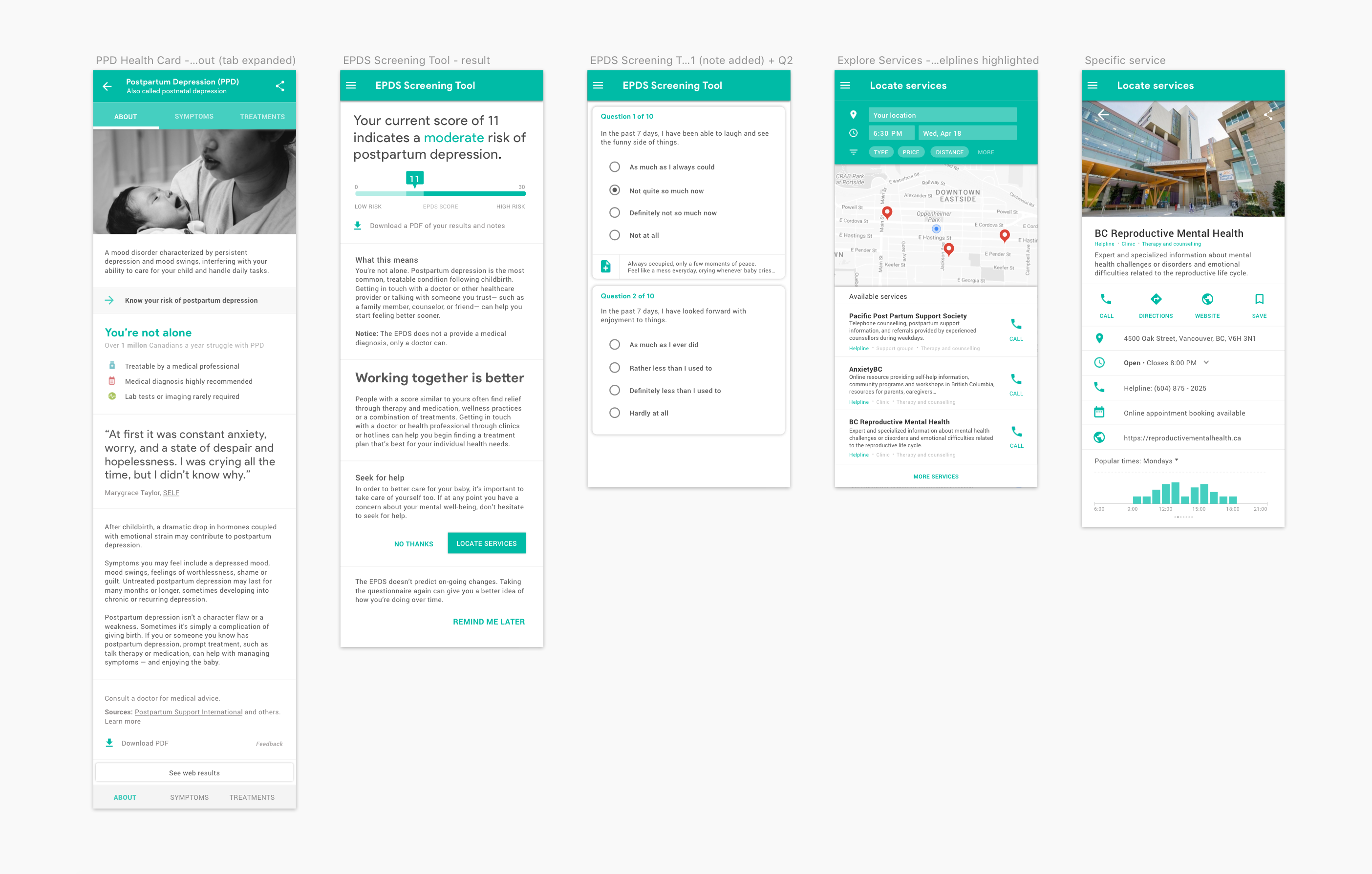
From consulting with industry professionals and conducting more research, we were able to create high fidelity mockups that were later used to create interactive prototypes. Our team had further polished the design through adding inline quotes, making both font and colour changes, and improving the overal spacing across all the UI components. I also created a user flow map to provide a better overview of our product and finding more ways that birth parents may come across our product.
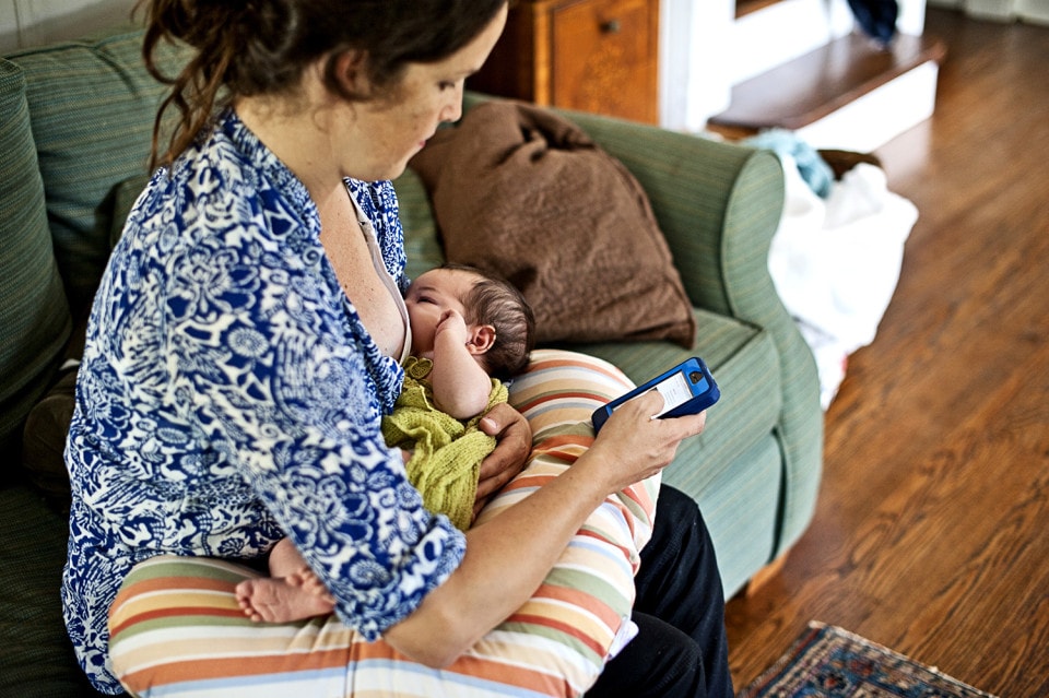
To help describe the intervention, we’ve grounded it in the following scenario which is one example, but not the only one a parent might experience...
We’d divided our intervention into five distinct stages: Discover, Learn, Assess, Seek, and Save. These stages provide different unique features to fulfill each new, urban, low-income parents’ needs for postpartum care. Moreover, they are also compatible with their pre-existing practices of accessing the internet through smartphones.


In this scenario, the new parent might not be aware that difficulties breastfeeding, especially any prolonged pain, is a common symptom and precursor to postpartum depression but instead a regular part of being a parent. As such, they may be googling for postnatal care indirectly. Also, recognizing the fact that our design couldn’t automatically assume that a parent is experiencing postpartum depression, we developed a more subtle way of integrating information about postpartum depression in the “other health conditions” and “people also ask” sections. Clicking on postpartum depression will bring them to our next stage.
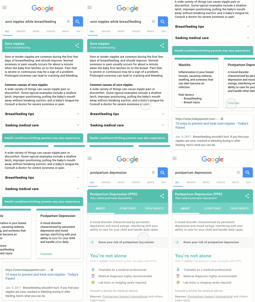
Indirect Search of PPD Cause
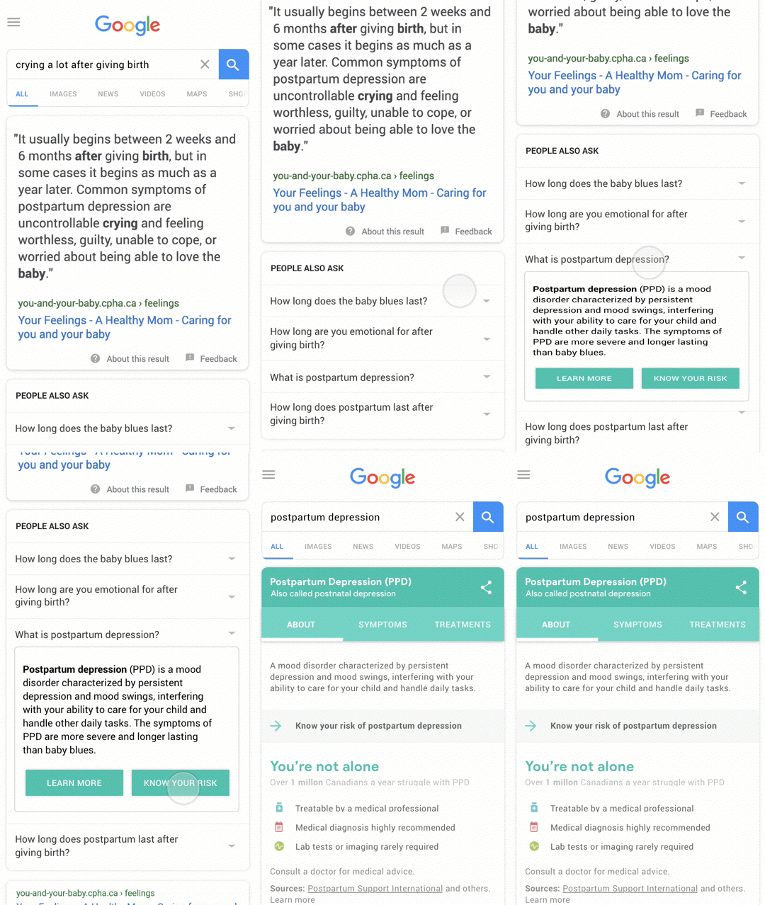
Indirect Search of PPD Symptoms

In the Learn stage, a health card provides a quick overview of what postpartum depression is, as well as more detailed information about symptoms and treatment options.
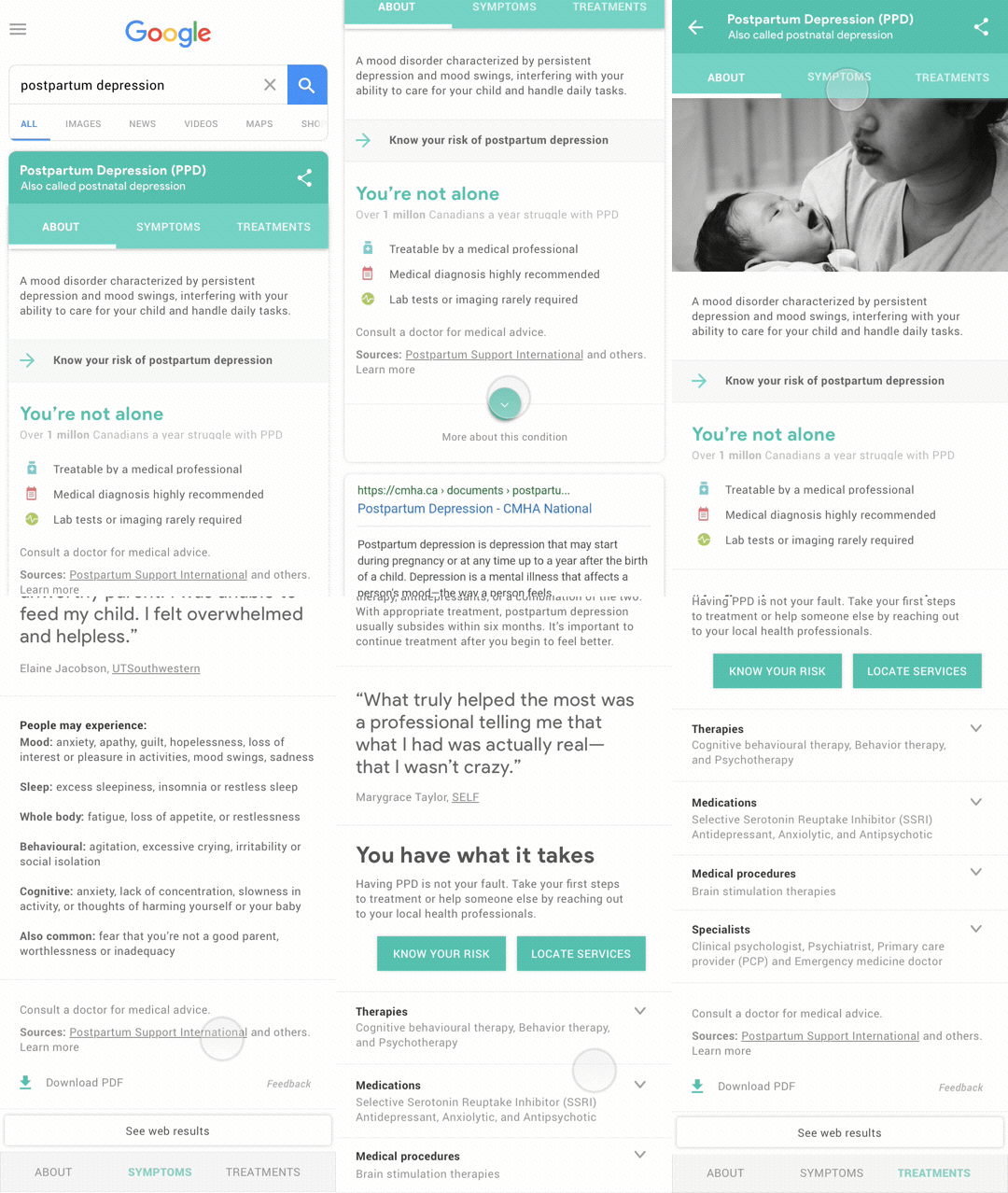
Health Card Preview
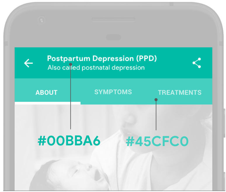
We recognize that postpartum depression can be a sensitive subject to discuss, so we used the colour teal to convey a tone that was trustworthy and empathetic; We user tested multiple versions of our prototype during which we asked participants to identify the colour they felt represented this tone the most.
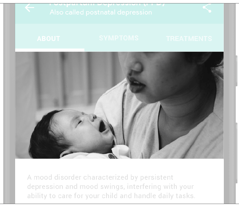
We also decided to use images throughout the intervention to humanize what parents might be going through and remind our users that they are not alone. We also chose to select images that represent mental health better than people facepalming or holding their faces.
In-line quotes help us describe symptoms and experiences in a more relatable way so that our user may think “Hey, that’s how I feel too”and be better able to realize any symptoms of postpartum depression they might be feeling and seek for more information or help.
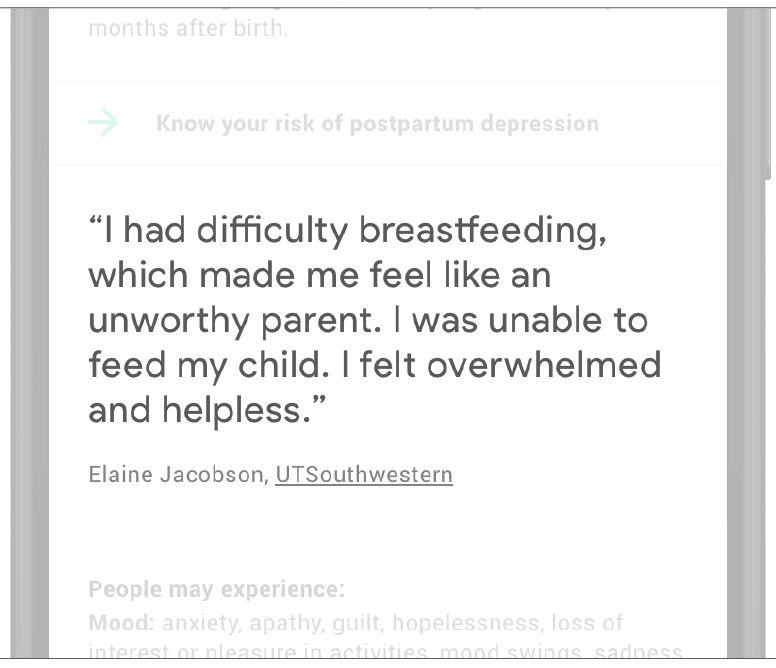
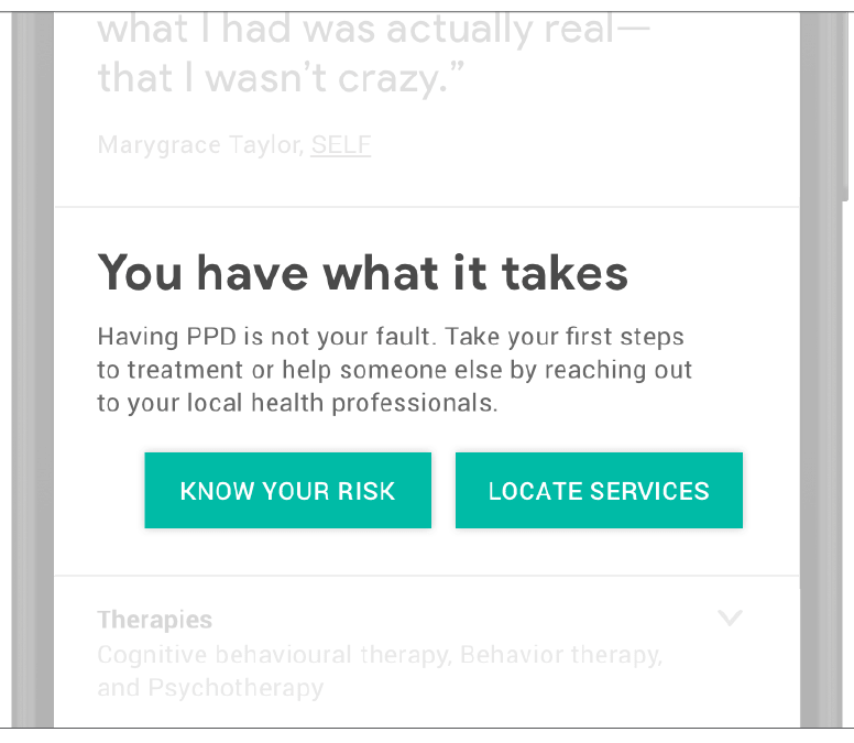
We focused on using plain, inclusive, and empathetic language to facilitate a better understanding of information and to also encourage our users to take action either through assessing their risk or locating services.

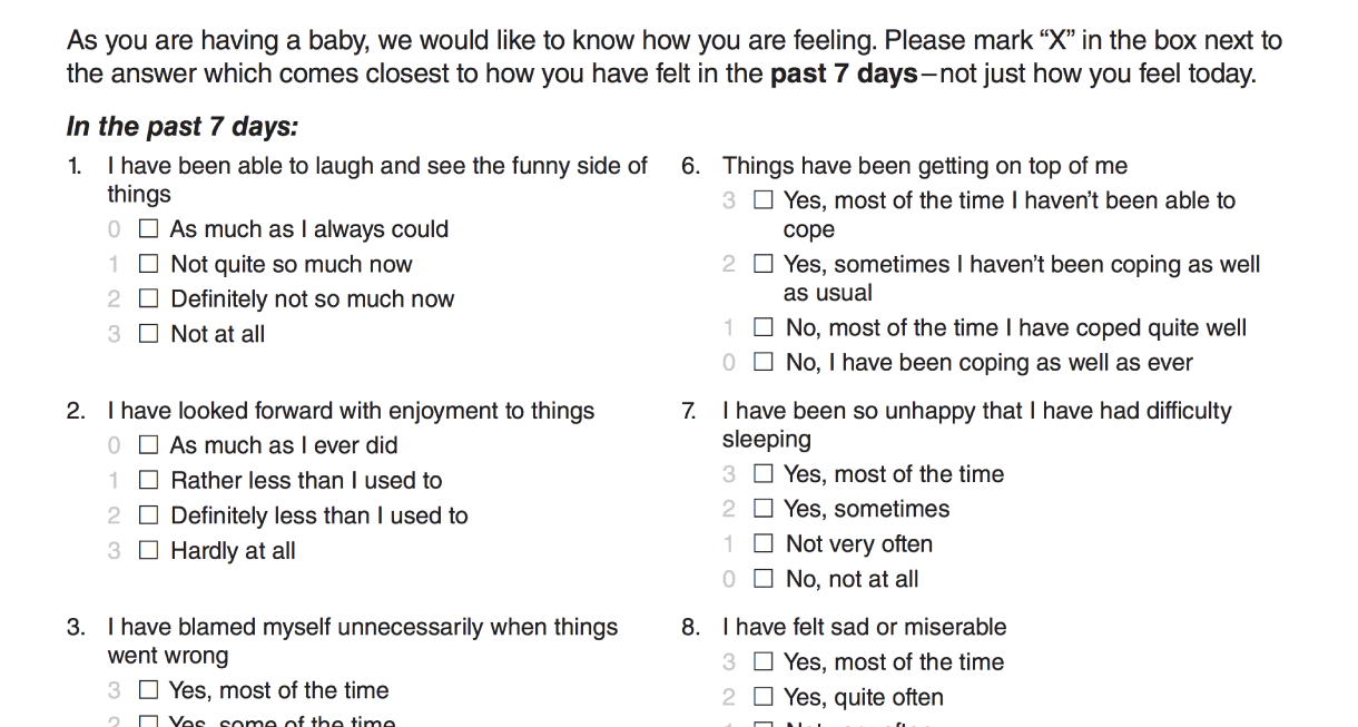
Mental health screening tools can help raise awareness and support seeking help earlier. But because our target population may not be aware of such resources due to systemic barriers, we decided to integrate the Edinburgh Postnatal Depression Scale (EPDS), a 10-item questionnaire widely used by health professionals to screen birthing persons for postpartum depression.
Before the user takes the EPDS, we set the expectations in that it is a screening tool which does not provide a diagnosis, and that regardless of the results, it is recommended to consult a health professional if there are any concerns.
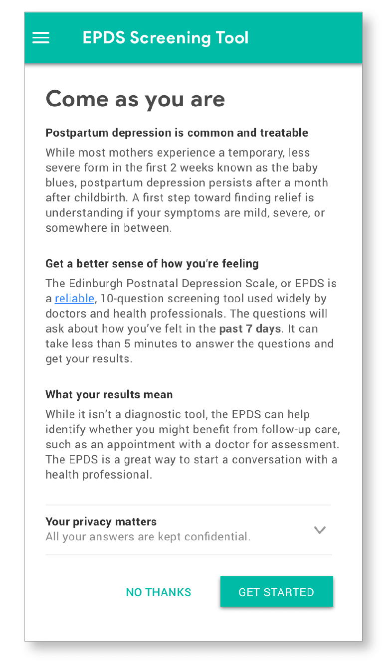
Interface Mockup of EPDS Mental Tool Preview
While taking the EPDS, users will be presented with a total of 10-questions that ask them to reflect on how they felt in the last seven days. To support our users in having more informed conversations about postpartum depression, we encourage them to explain or elaborate on top of their answers through the “add notes” function.
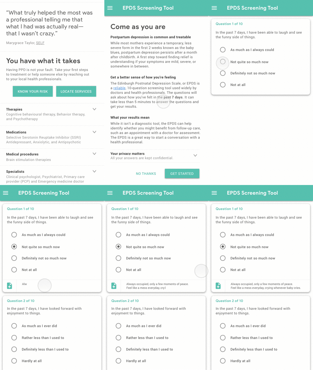
Some mothers may want to explain or elaborate on their answers with a health provider (Shakespeare et al, 2003)
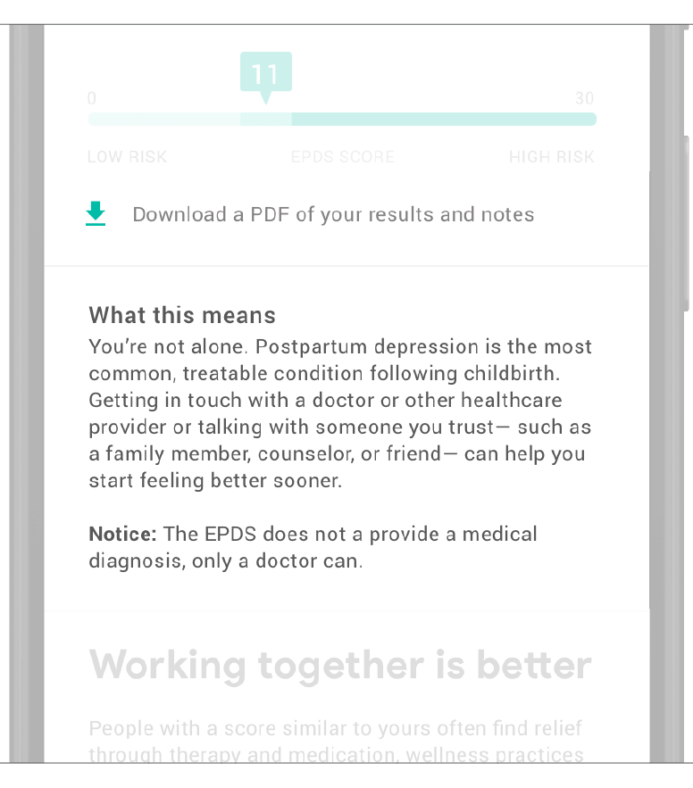
Once users complete the questionnaire, they will receive a score indicating their level of risk and what it might mean.
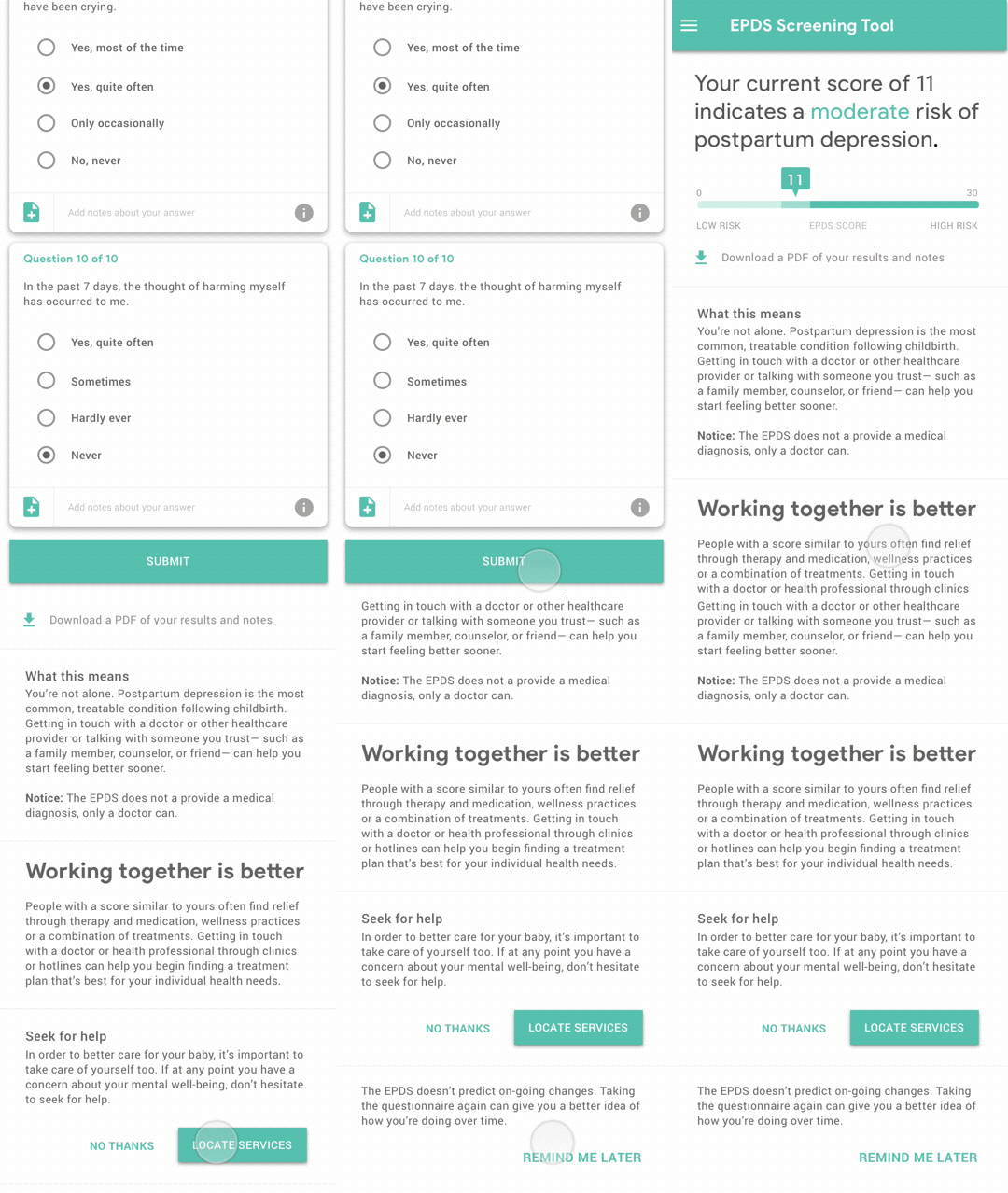
Preview of the Result
At this time, the results can be downloaded as a PDF for offline use and will not be saved by Google. We remind the user again that the EPDS only screens for postpartum depression and that only a health professional can provide a diagnosis or treatment plan.
To support our users in engaging with professional help, we also implemented a CTA for locating services.
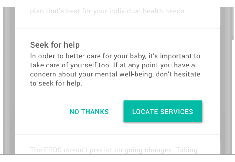
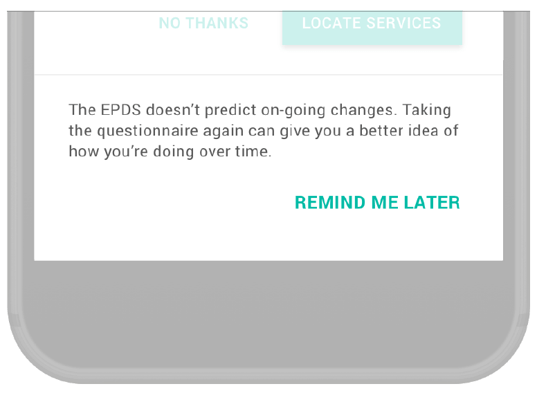
Finally, the “remind me later” section provides opportunities for the user to more consistently take the EPDS which will give a clearer picture of their mental well-being over time. Reminders are set and sent via email, text, or calendar events.

Our research indicated that for new, urban, low-income families, locating services is the hardest part of getting help, especially if time or money is a concern. To help our users find services that meet their specific needs, we provide filters for availability, the type of service, its cost, how far away it is, or additional things that might be helpful for their visits such as free parking or on-site childcare.
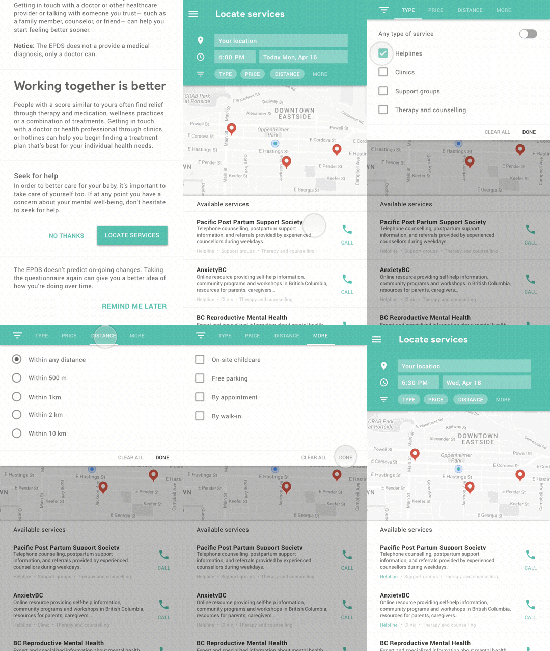
Filtering services helps new, urban, low-income parents to streamline their process of locating postpartum care services.

The last part of our intervention involves “saving” services for later. The reason we did this is that our research revealed that our target population uses technology in short bursts; often only 10-15 minutes per day. That being said, the side menu provides an easy way to access “saved” services enabling a sense of continuity so our users can pick up where they left off.
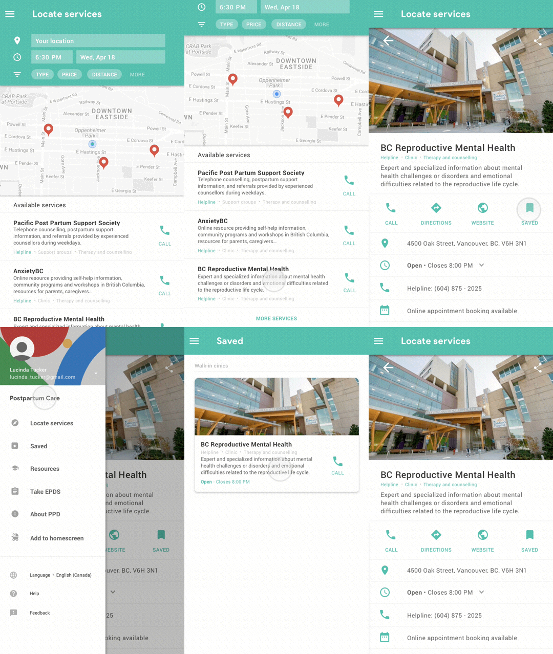
To accommondate birthing parents's short use of technology, the saving features allows the users to pick up where they left off.

Although our scenario began from an indirect search, we’ve also considered how direct searches for postpartum depression, services or resources such as the EPDS may lead to our intervention. For example, a search for “postpartum services” will display a short list and further allow users to locate and filter services accordingly. Searches for the EPDS will enable users to take the screening questionnaire within the search results immediately.
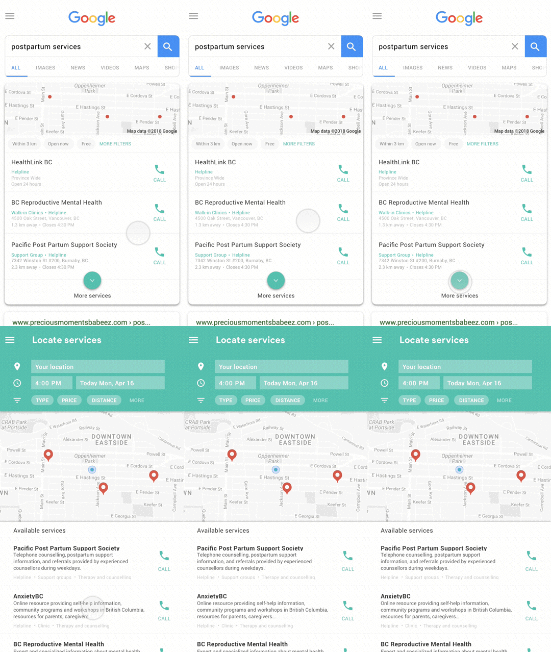
Direct Search for Postpartum Services
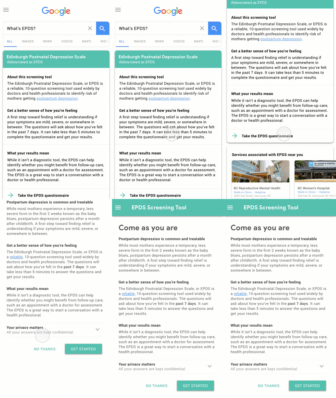
Direct Search for EPDS
As humans and designers, we believe it is our job and mission to design for basic human needs. Mental health illnesses like postpartum depression are one of the most common complications of childbirth that severely impact the quality of life and relationships for a parent. While our design solution does not carry groundbreaking characteristics, it equips new, urban, low-income parents with the tools to access and understand information and resources that support them in coping with postpartum depression.
The project taught me never to overlook the small details and the importance of copywriting. While my teammates were in charge of most of the content for the prototypes, I witnessed the importance of language and tone in changing people's perception and making the design emphatic. For instance, one of the most memorable times I had throughout the project was when our team described the target audience as “birthing parents” throughout the presentation came into realization by the audience as being gender-inclusive. That to me was genuinely delightful since I discovered how easily these small details can impact our experience.