design process
MOTIVATION
At the beginning of this project, our team had decided that we would focus on creating an application that contributes to the overall happiness of a person’s life through rekindling human connection. And by establishing that, we could help improve each’s mental health and their well-being.
OPPORTUNITY
During our research, we specifically studied the relationship between parents and their adult-children and how there appears to be a gap. According to Robert Neil Butler, as people [adult children] age they begin to look back on their lives as part of a naturally occurring mental process. They may reminisce and dwell on past unresolved conflicts. So to move forward from this distress and unhappiness, there needs to be some resolve. Therefore, whether it occurs through support and understanding or facing recent problems, we want to encourage our users to communicate with each other and urge them to reconnect and potentially overcome old issues.
To summarize our research, Dr. Green states “problems may arise between parents and adult children when they fail to communicate effectively. [. . .] The resulting communication gap often leads to friction.” Considering this information, we aim to create an application that reminds users to spend time with their loved ones and shows that they care.
PROPOSED SOLUTION
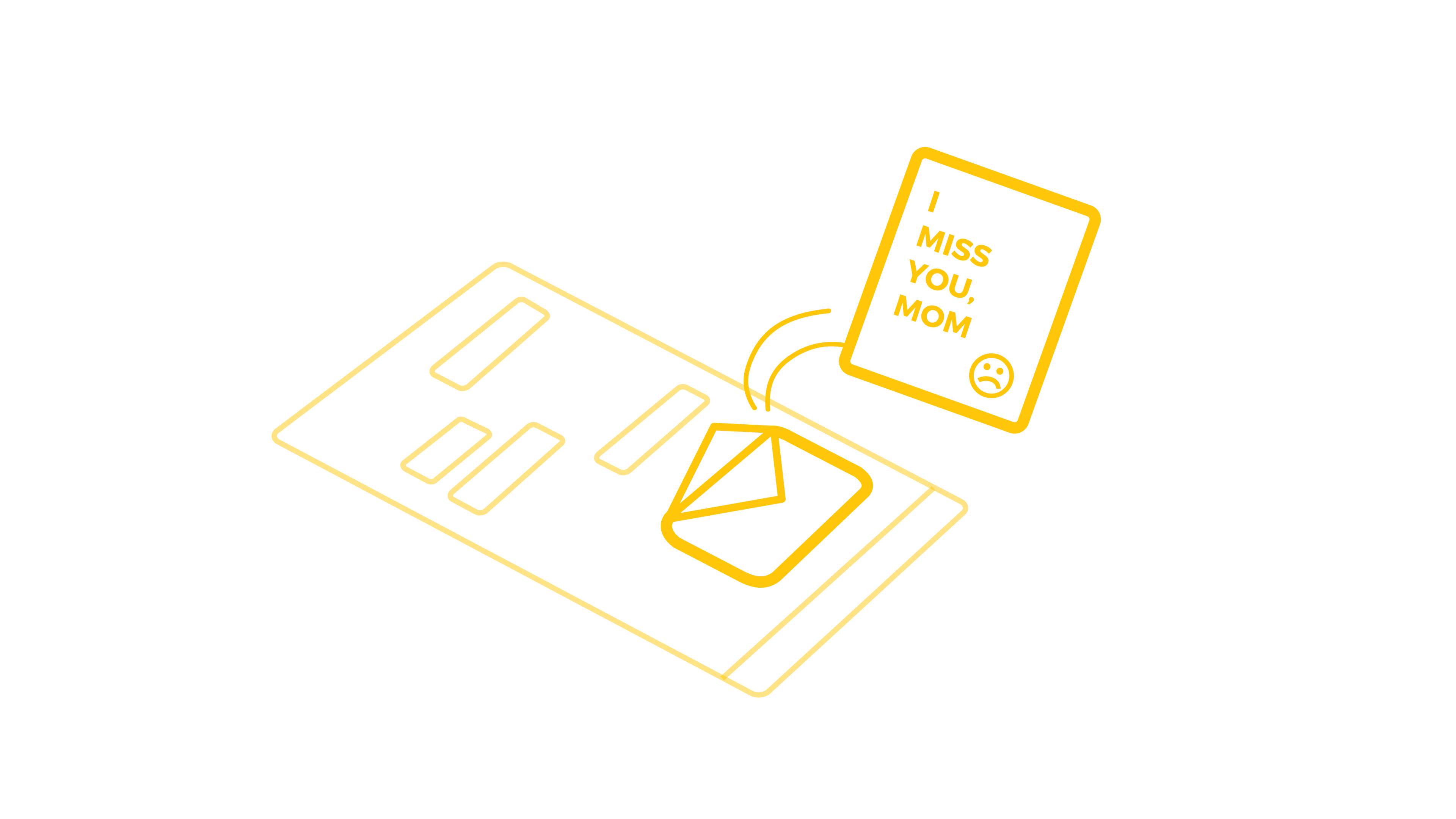
Digital technology has become a predominant mode of communication within families, and we thought that there is an opportunity to utilize this growing way of communication and design a mobile/tablet application that makes use of other social networking apps. Therefore, we proposed a mobile application that can deliver ‘letters’ which can be shared through these various social platforms and allow the users to express their personal feelings and thoughts.
Joyful Social Extension - Digital Letter
TARGET AUDIENCE
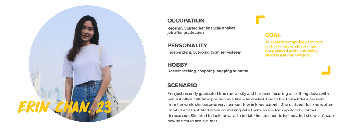
Initially, we had set our target audience to independent adult children from the age of 22 to 49. These individuals would often face conflict and struggle in balancing their life between work, family, friends and also their romantic relationship with their partner. However, after further consideration, the application became more narrowed and targeted towards younger generation who had just begun their career or had finally settled down with some decent establishment within their work field.
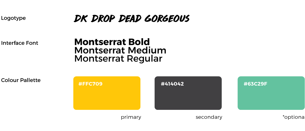
DEFINING THE BRAND
We wanted our app to give out a warm, engaging, and positive feelings for the users. To achieve that, We had selected yellow with a relatively high saturation as our primary colour for the design, along with a dark grey as the secondary colour. Also, within my interface design, I also emphasized on using more rounded shapes to provide more friendly and cheerful experience.
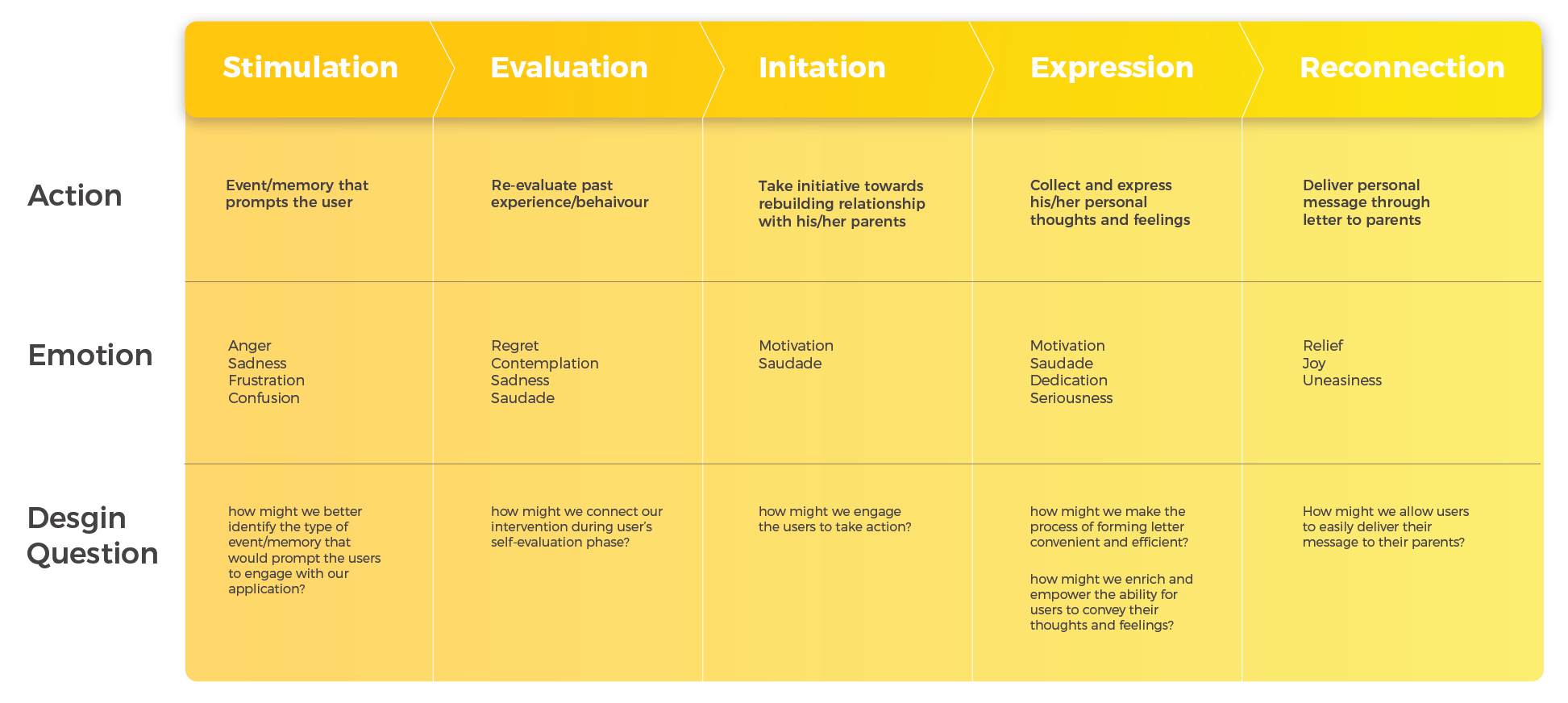
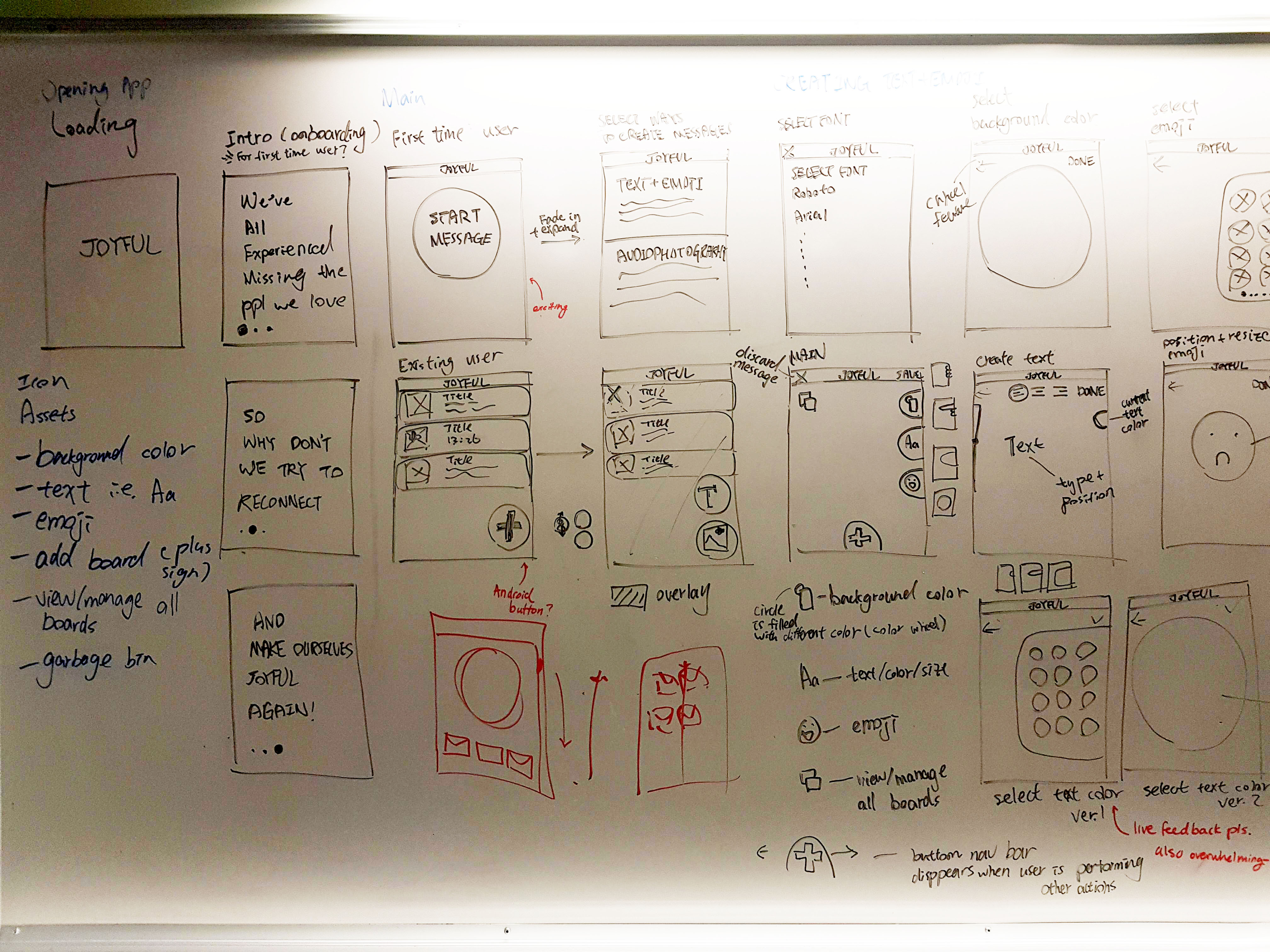
JOURNEY FRAMEWORK
I reiterated and made a journey framework to demonstrate the user experience of our users. This framework provided us with a brief context of how the intervention may be entered, used, and exit.
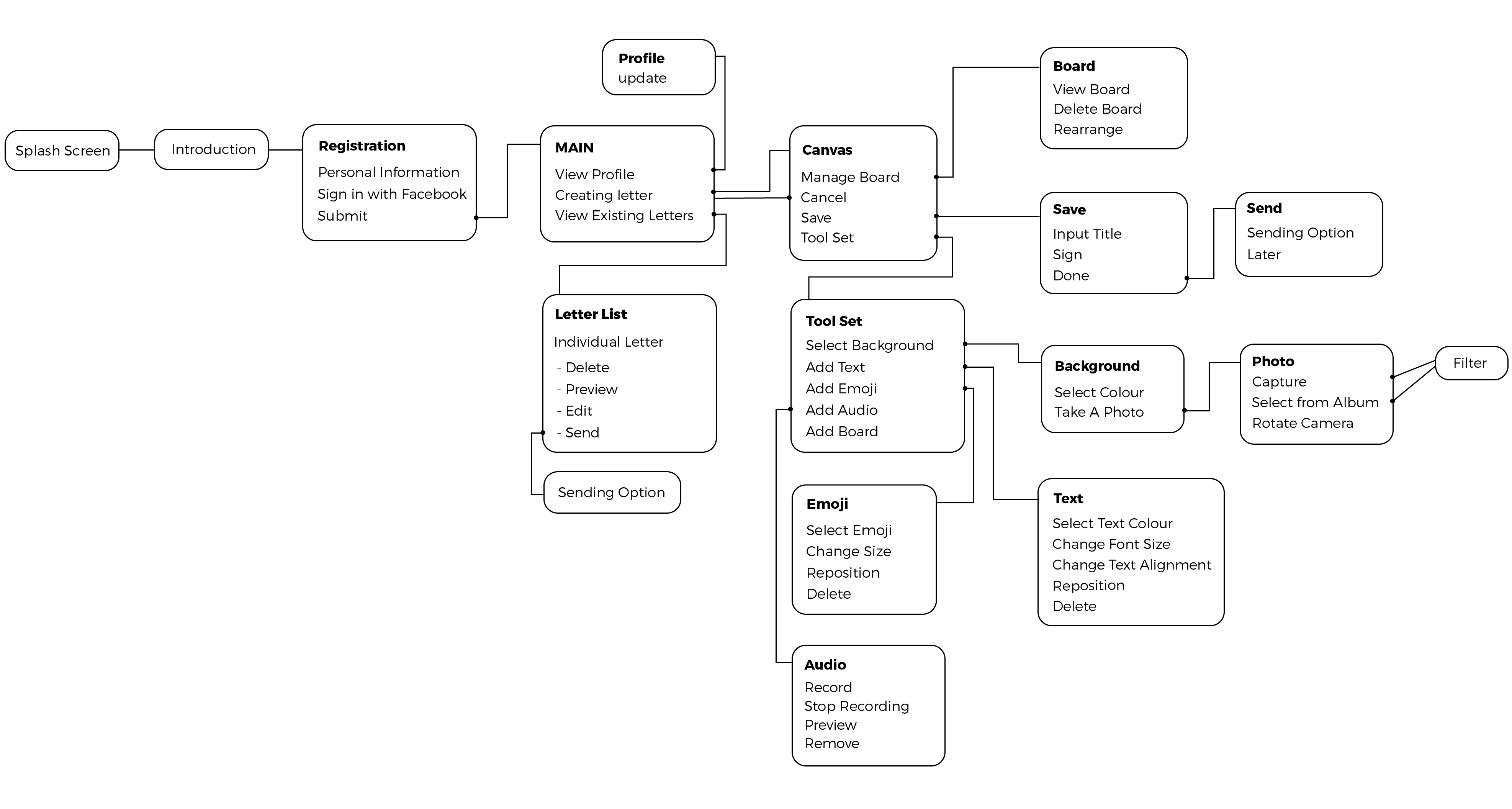
APP FLOW AND INFORMATION ARCHITECTURE
Before the entering the UI design stage, I wanted to understand what are the essential feature and artboards that are required to showcase our product. So I had created an app flow with information architecture built to help me with the user flow and the high fidelity mockups later on.
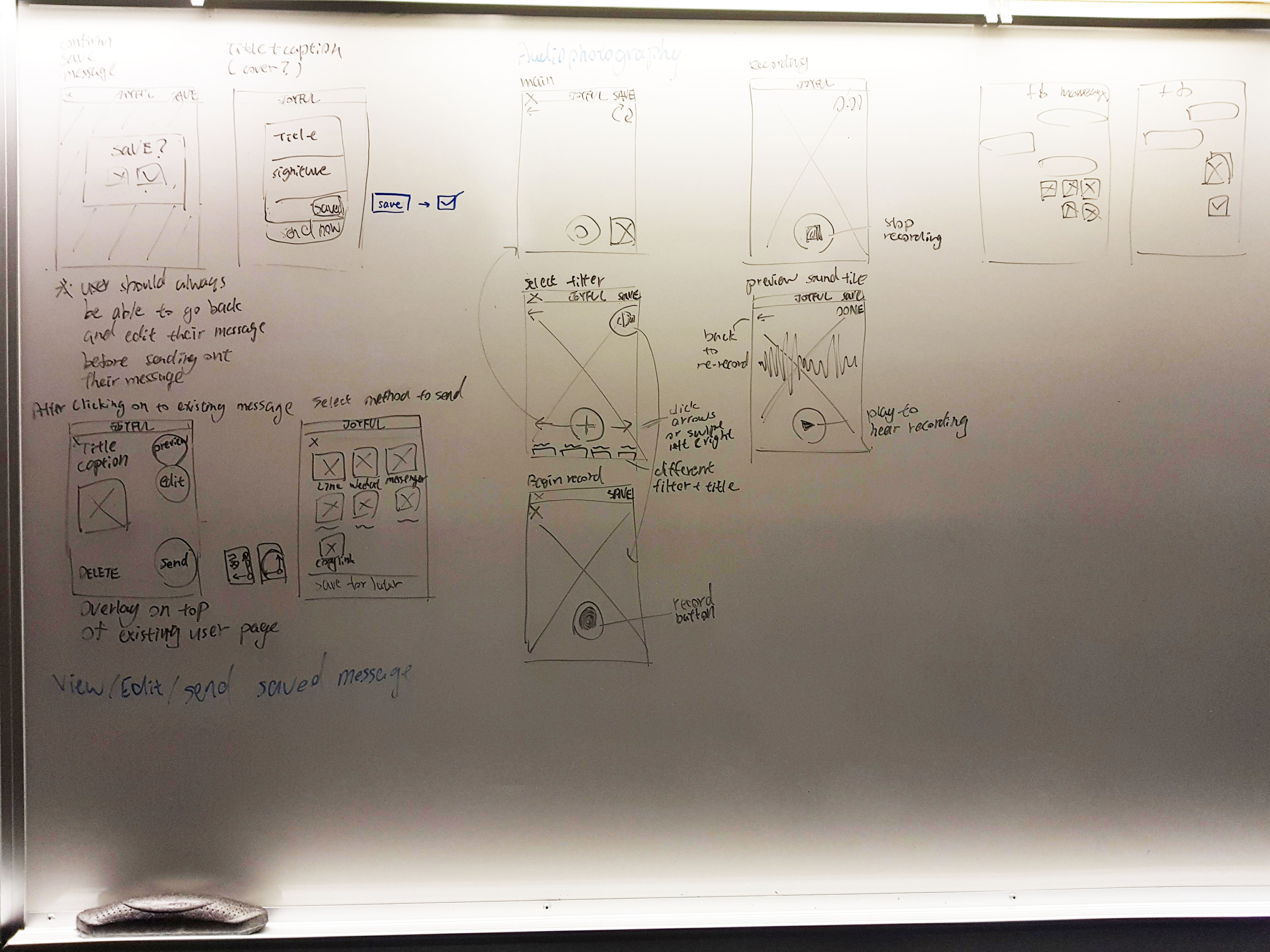
USER FLOW
I had mapped out a basic user-flow to simulate how each part of the application would look, and be used; this helped me in designing the interaction between each button and interface as it allowed to think of the transition from one screen to another.
Photos showcasing use flow mapping
execution
REGISTRATION AND ONBOARDING
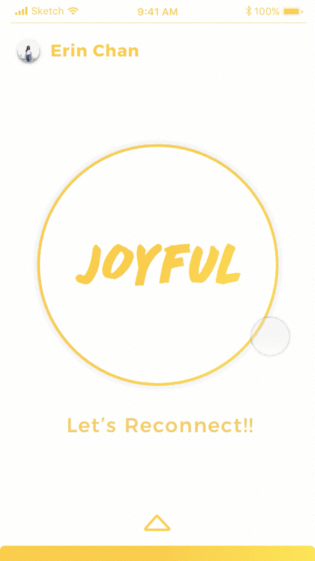
A short Introduction of the application was shown when the user first entered the app; this helped us in quickly defining the purpose of the application as well as setting the mood for the users. Afterward, we had also provided a streamlined process of registration enabling the users to access the main component quickly and to create their digital letters.
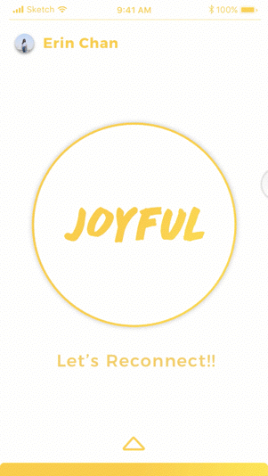
On the main page of Joyful, I put a strong emphasis on the letter forming button, providing a great sense of call-to-action, and also signifying the importance of this one feature. This also gave the users high learnability which helps to prevent cognitive overload from adapting to the app. Besides, I had also added an onboarding process to guide the users through the main page.
Confirmation Page Preview
CREATION
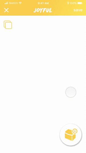
Canvas
For the letter design tools including background, text, emoji, audio recording, and adding new boardings, I decided to collect and pack them into one ‘Toolbox.’ By minimizing visual distraction, that way the users could solely focus on the design tools themselves instead of having to diffuse their attention with the navigation bar and the managing board button.
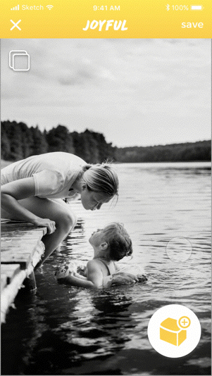
Select Background
We wanted to maximize the freedom for the users in customizing their letters. Therefore, I had reiterated the background feature and provided two options in creating backgrounds for each board of the letters. This includes choosing a colour or setting a photo as the backdrop. From the user experience perspective, I had minimized all the unnecessary visual elements and to increase the learnability of the design features.
Background Select Feature
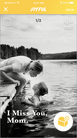
Texts and Emojis
Base on the fonts the users have selected at the beginning of the session, users could add texts with customized colour, size and horizontal alignment. For adding emojis, users could choose the one expression that best represents how they feel from our pre-made library. I also designed it so the users can always delete unwanted text or emoji by dragging and dropping them into the recycling icon.
Audio Recording
To strengthen the effectiveness of a letter, we also wanted to give users the ability to attach their voice recording to the letter. So people who may not be great at writing messages can speak about their feeling while showing photos of memory to their loved ones.p>
“With every photo there is a story, a moment, a memory. As time passes, however, the user’s ability to recall the details needed to evoke the moment the picture records fades. Adding sound to a photo can help keep the memories intact.”
Manage Boards
Adding new boards to the letter allows a much more interactive way of reading; it helps the receivers to focus on reading through the messages and simulates a feeling of looking through an album.
The manage board icon is the only feature that's excluded from the toolbox. That's because its purpose is to allow board management rather than designing any visual components of the letter. Therefore, I’ve categorized the feature as a macro design tool and had placed the icon within the top left corner of the canvas across all the boards; providing consistent and quick access for the users to manage their boards.
SAVING AND SENDING
After saving the letter, users could either send the message immediately or preserve it for later. By pulling up the letter list on the main page of Joyful, users could revisit the past letters they’ve made and could either preview, re-edit, or share the messages through other social networking applications.
Send letters through different social applications
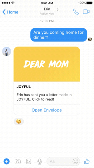
RECEIVING
Once the recipient had received the letter, a modular popout window would appear when accessing the message; allowing the recipient read on any social application she/he uses. The audio play button is placed beneath the letter at all time so that the users can play or pause the sound at any given moment when reading through the message.
Receive letter through FB Messenger
final thought
There is always the doubt of whether the digital letter would be able to convey sentimentality and I do agree that limitation does exist with these advanced technologies. However, I believe what indeed matter comes from the heart and the message, and form merely is just a medium to carry through that message. Our proposed intervention provides that medium and empowers them to express their thoughts and feelings by offering different forms catered to their personal preference.
This project was inspired to rekindle the relationship between the adult children and their parents, which is in fact very relatable to me. As I’ve grown up and become more ignorant towards my parents- who spent an insurmountable of time raising me, this project allowed me to further reflect on my behaviour and to improve upon this self-evaluation. Besides, I was able to redesign the interfaces after the submission of our project. This gave me a chance to explore more patterns and opportunities within one user flow. It also further allowed me to advance my interaction design skill.