Visier transforms workforce data into insights in an easy-to-digest format so that businesses can make critical decision in managing and planning development for their employees. Throughout the 8-month internship, I worked on various projects ranging from interaction, visual, motion design as well as some research work around design system.
Some of the notable features/components I helped to design for includes Context Overflow, Granularity Change, What-If, and Button Usage.
User Experience Designer
Sketch, Illustrator, Principle, Zeplin, Jira
Internship
8 months (September 2018 — May 2019)
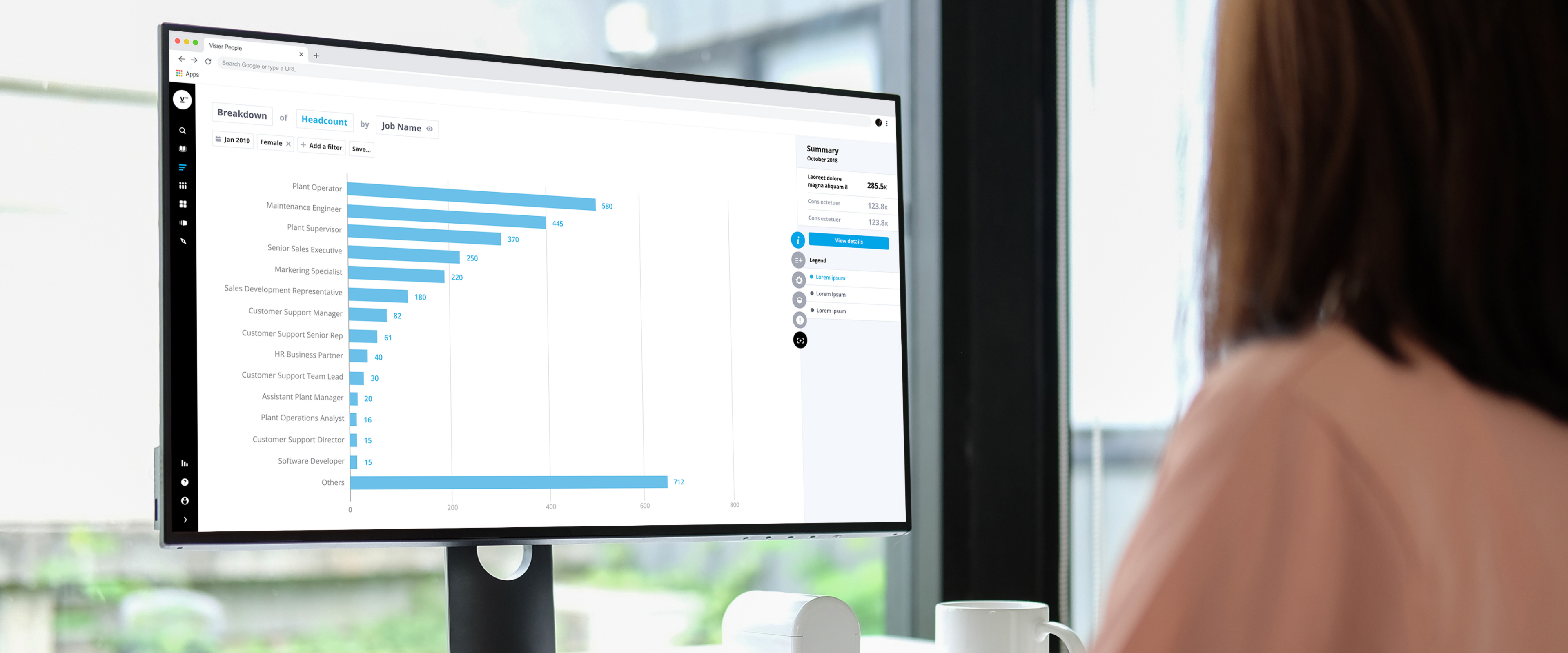
The term ‘Context’ refers to a collection of one or more attributes that helps the users to analyze a specific population of their companies workforce. The incentive of the project was the lack of means to deal with the excessive number of context filters from distorting the chart. Despite being an edge case, if left unattended, users could face a serious challenge to understand the analyzing population. The rework aimed to improve the experience by providing readable contexts and visualization.
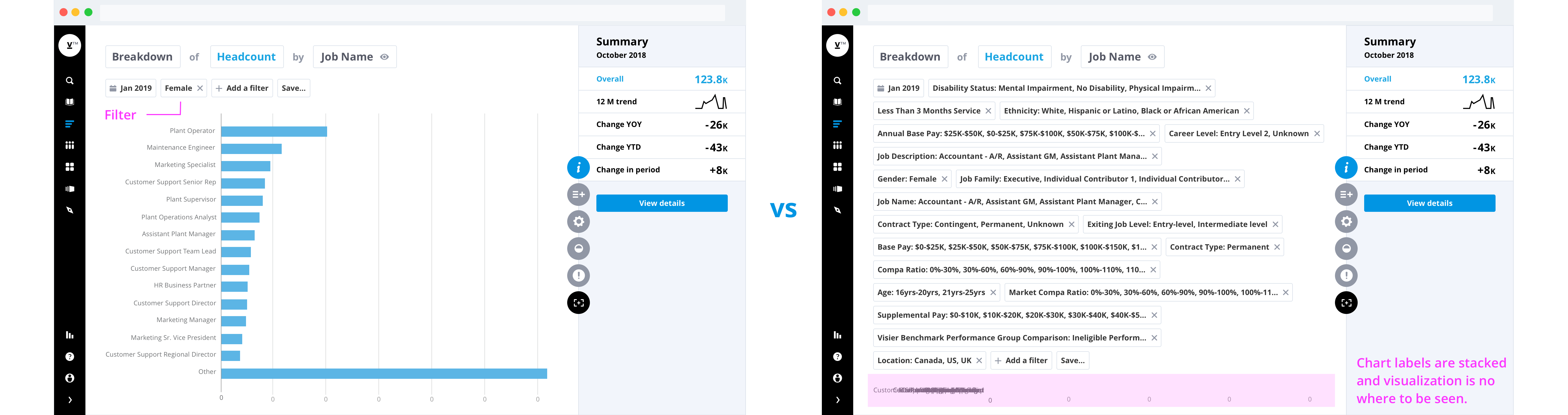
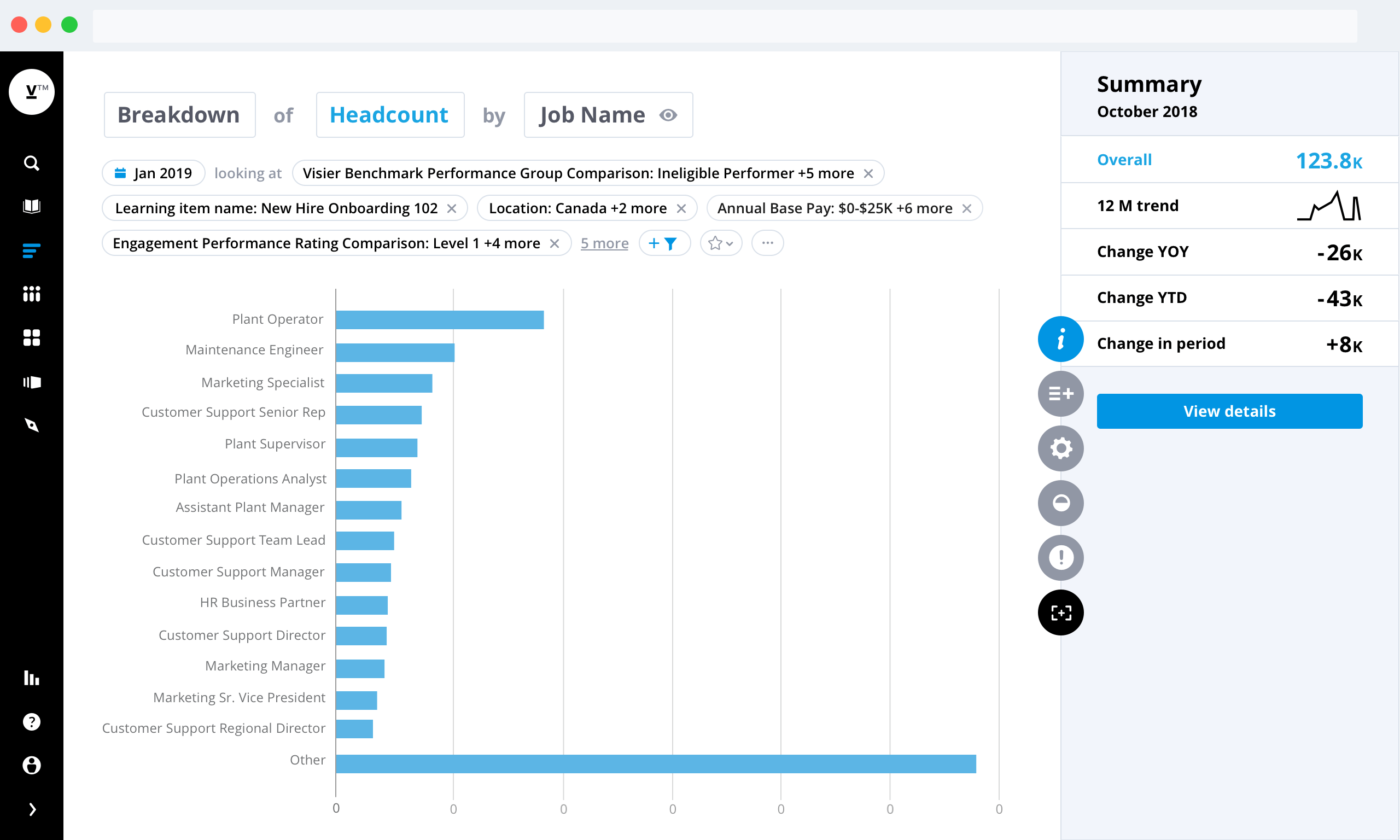
As context overflows, users lose visibility of the visualization.
Before jumping into the actual design, I conducted secondary research and looked at common examples of how overflow/excessive content is handled across different platforms. Some examples include, horizontal scrolling space, read more/read less, and modal container. I sketched out these ideas on paper to see how it may fit into our product UI. From there, I made multiple iterations in Sketch to share and to receive feedback from other designers and my mentors. In the end, we decided to employ the "show more/show less" approach, so that context and visualization fit on the same page. Since many of our customers export their analysis into other formats such as PDF and PowerPoint for presentation usage, we wanted to optimize for readability in a flat layout.
I looked at how others deal with overflow content to find reusable pattern and design inspiration.
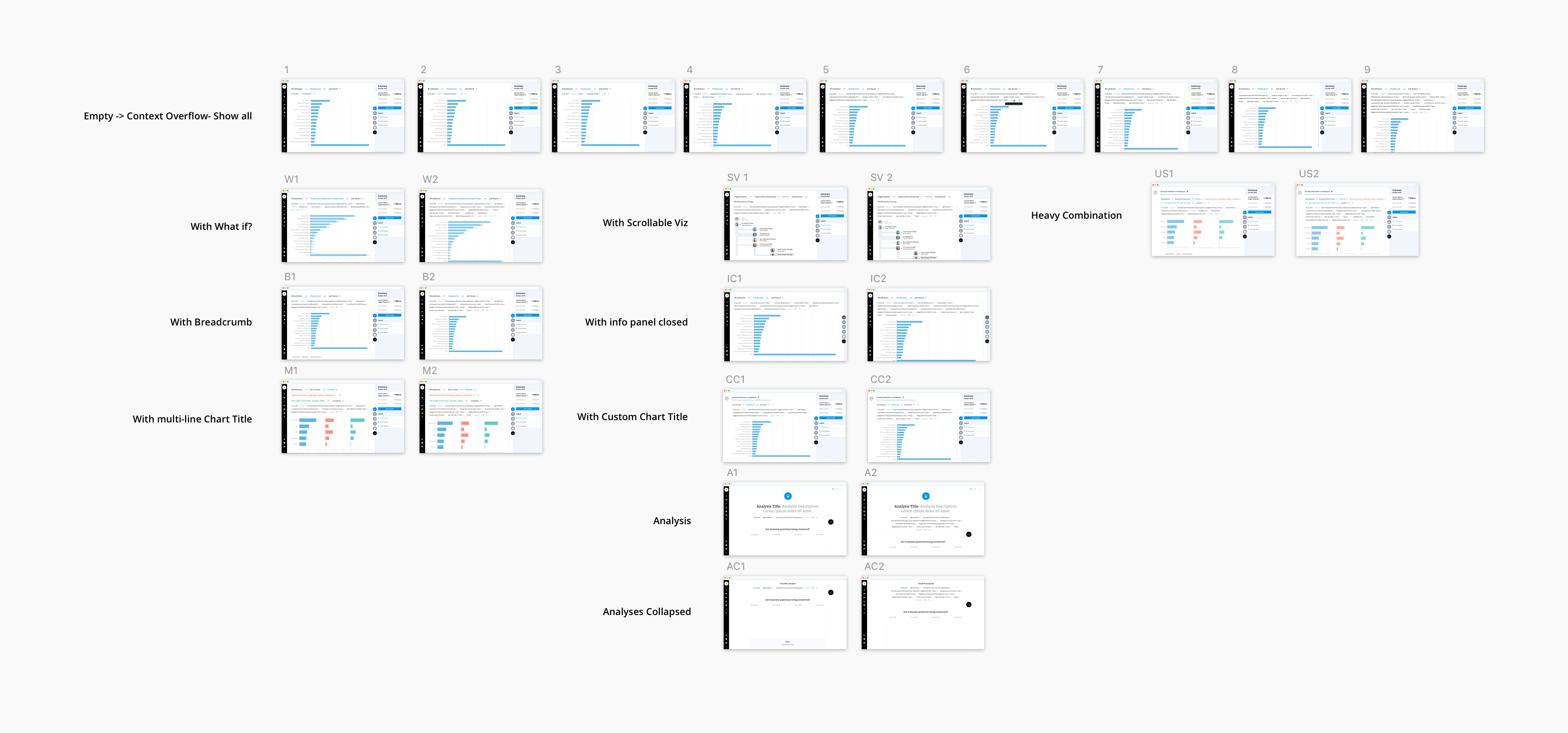
Since the assignment was to redesign part of the UI instead of the whole screen, I used mid fidelity mockups to test out different ideas in Sketch.
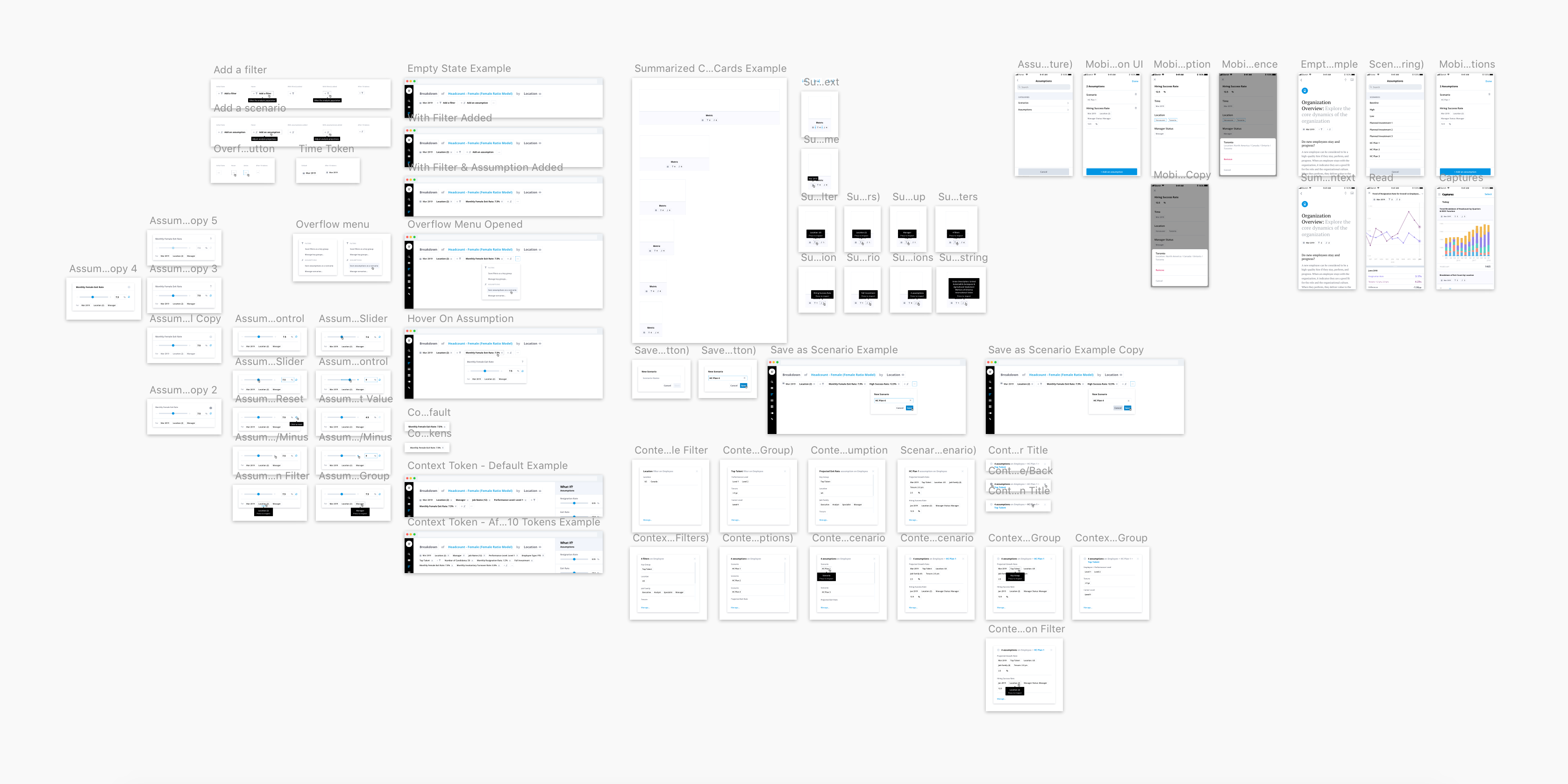
Although for this assignment I was tasked to design for when filters become overflow, it is crucial to account for all the UI elements and user scenarios to ensure the usability and feasibility of the redesign. For that, I reached out to my mentor, designers, and developers to create a set of templates in Sketch to stress-test my design.
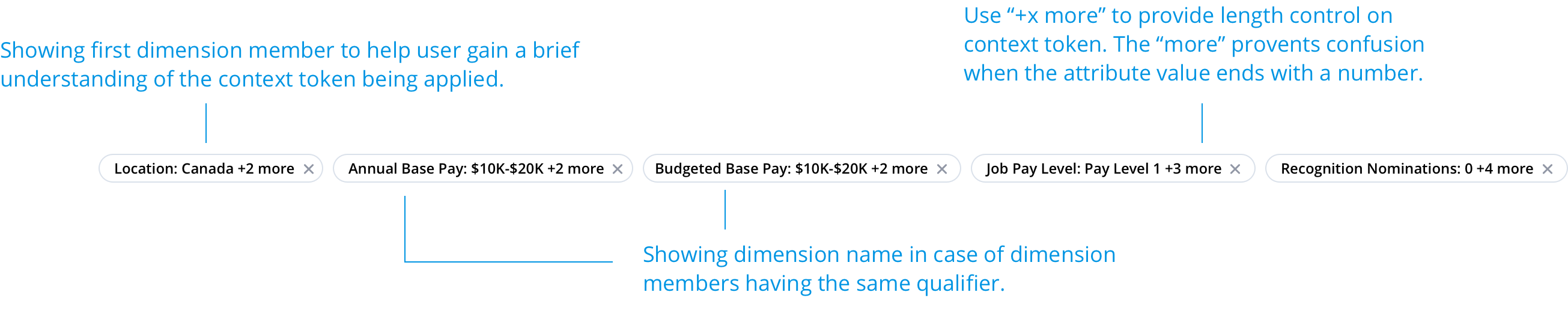
When context reaches over three rows, the remaining filters are hidden and represented as "x more." Clicking on to "x more" will push down the chart while revealing the rest of the filters. To reduce the chance of context from overflowing, I also redesigned token sizes. In Comparison to previously where filters get truncated at an arbitrary length, they now display the first attribute member and "+x more." This way, we make sure the users can still understand what each token filters while reducing the length of the token significantly.

In addition to providing minimal viable product, I also shared a vision proposal with my team to show opportunity for future product development.

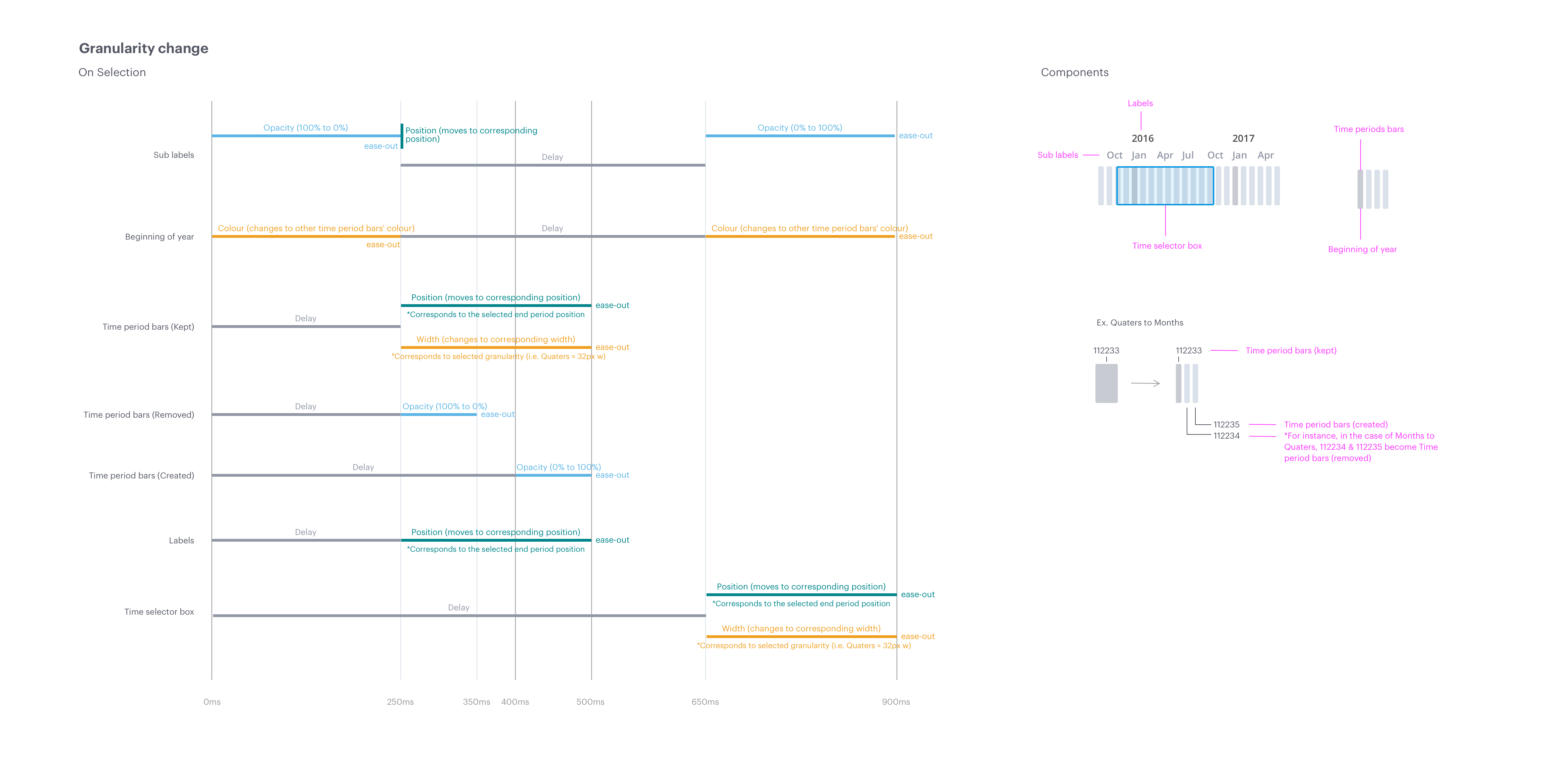
Time window is a feature which allows users to control the number of time periods in a time-based chart (i.e. a trend chart), so that the users can see the change overtime on the analyzing subject. Due to technical limitations, when switching time granularity (i.e., months to weeks), users weren’t able to retain the selected range. Instead, the new range was reset to a predetermined value by Visier. My task was to solve the confusing transition during granularity change; by utilizing motion design and allow users to understand the change.
The above example is the implemented experience at the time. The transition between from weeks to months is too quick and too confusing for the users to understand.
The problem before was that changes were happening altogether. After collaborating with my developer partner, we were able to develop the transition into several micro-segments. That way, users can perceive and make sense of the change in sequence.
Granularity change from weeks to months.
Granularity change from months to quaters.
To provide references, I’d made motion design spec outlining the details of the transition, including the components that are taking actions, the type of visual change, and their timing and duration. Here is the complete file.
What-if is a predictive feature that empowers organizations with insights on how individual decisions may impact their future business outcomes. Organizations then can better plan to manage their workforce and talent acquisition. As Visier continues to grow, the company is further advancing the capability of What-if. One integration is to allow users to explore diverse business outcomes by applying assuming context on to the analyzing chart. My role within this project was to support the UX design lead and create UI components for the workflow proposal.
After meeting with the UX design lead, a visual designer, and three engineers, a brief was formulated with a list of UI components to be made. Most of them reused the preexisting UI without creating net new pieces. Others were made through abiding the standard style guide. My mentor and I hosted a weekly meeting with the rest of the team to discuss and update on missing components.
For deliverables, net new components were uploaded from Sketch to Zeplin and shared with the responsible engineers. I’d also made a document consisting of all the UI elements used for the feature; including different interactive states and responsive sizing.
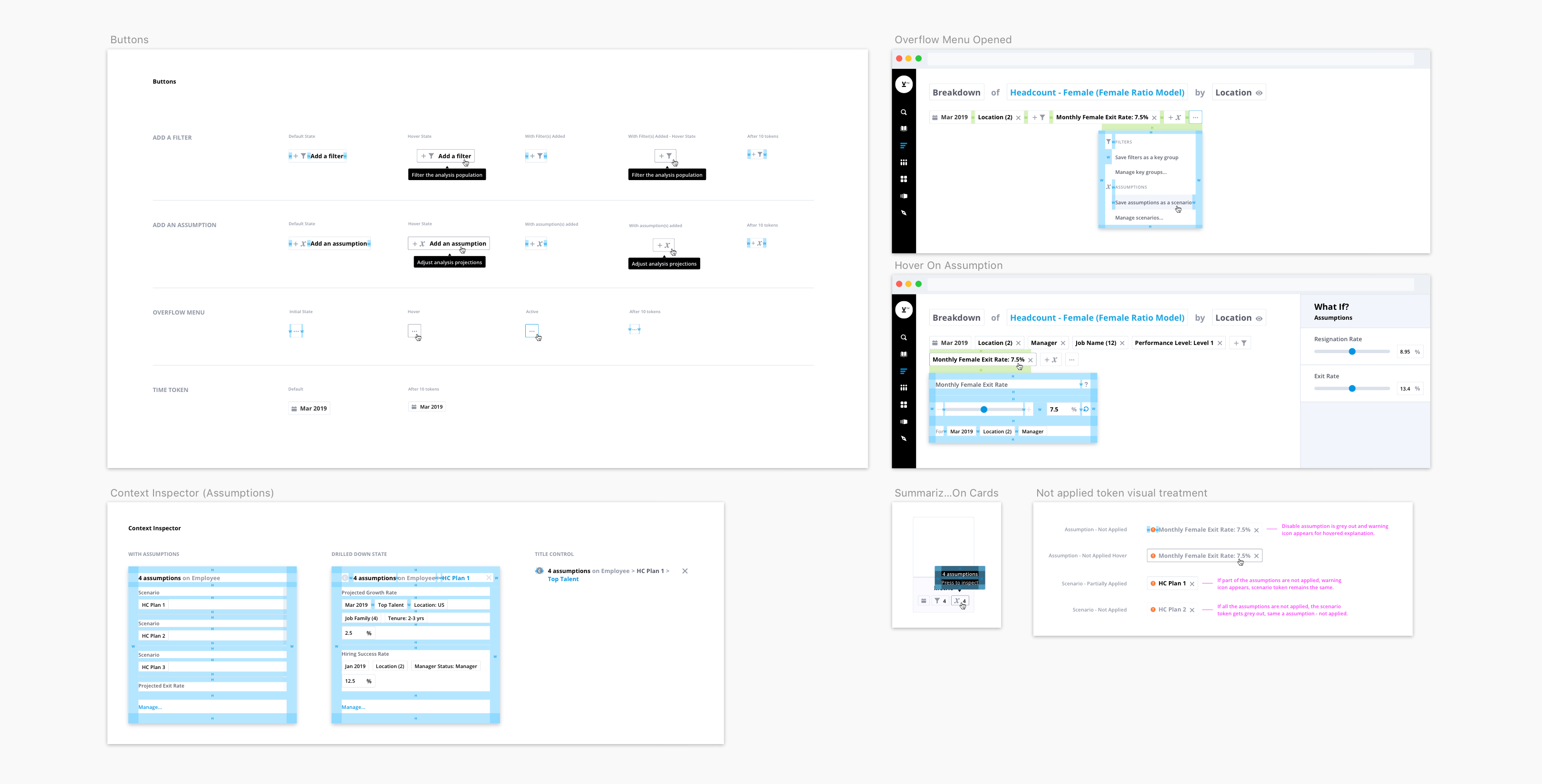
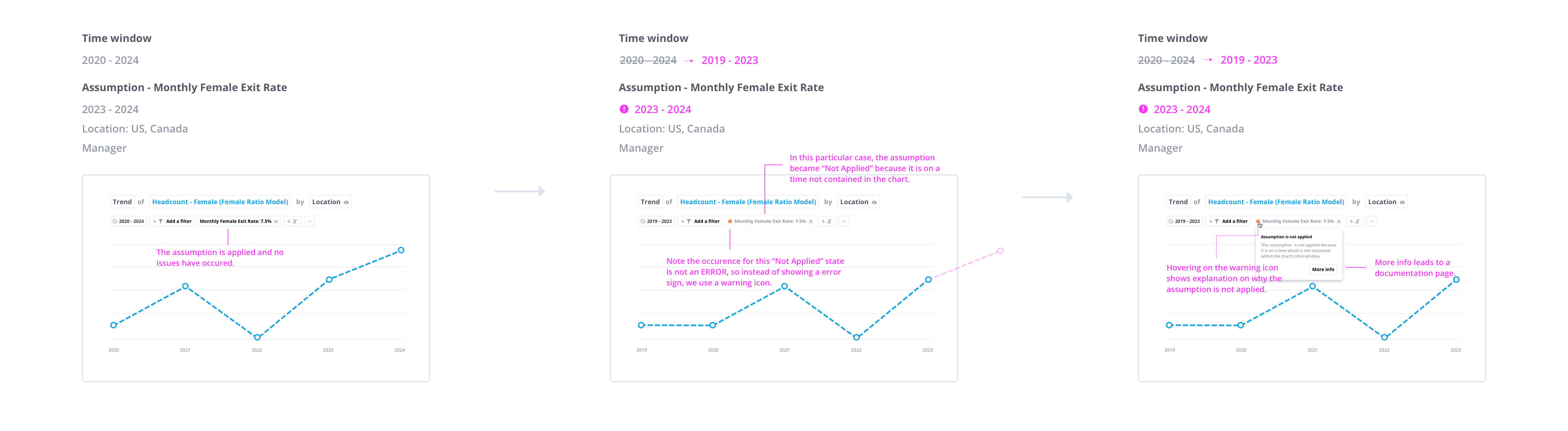
Despite What-if being a powerful tool for workforce planning and management, it comes with certain limitations. For instance, when the assumption is on a time that is not contained in the chart. The assumption becomes ‘not applied.’ For this purpose, a visual treatment for these “Not Applied” state is vital in informing the users of which context token is, in fact, affecting the chart and which one is not. [PDF]
In the current experience, Visier has many UI inconsistencies (colour, spacing, usage...etc.). This was caused by 1) designers providing visual spec that was not aligned/off from the style guide, 2) developers coded the UI that was not up to spec or 3) transitional issue from the old platform to the new one — Visier People.
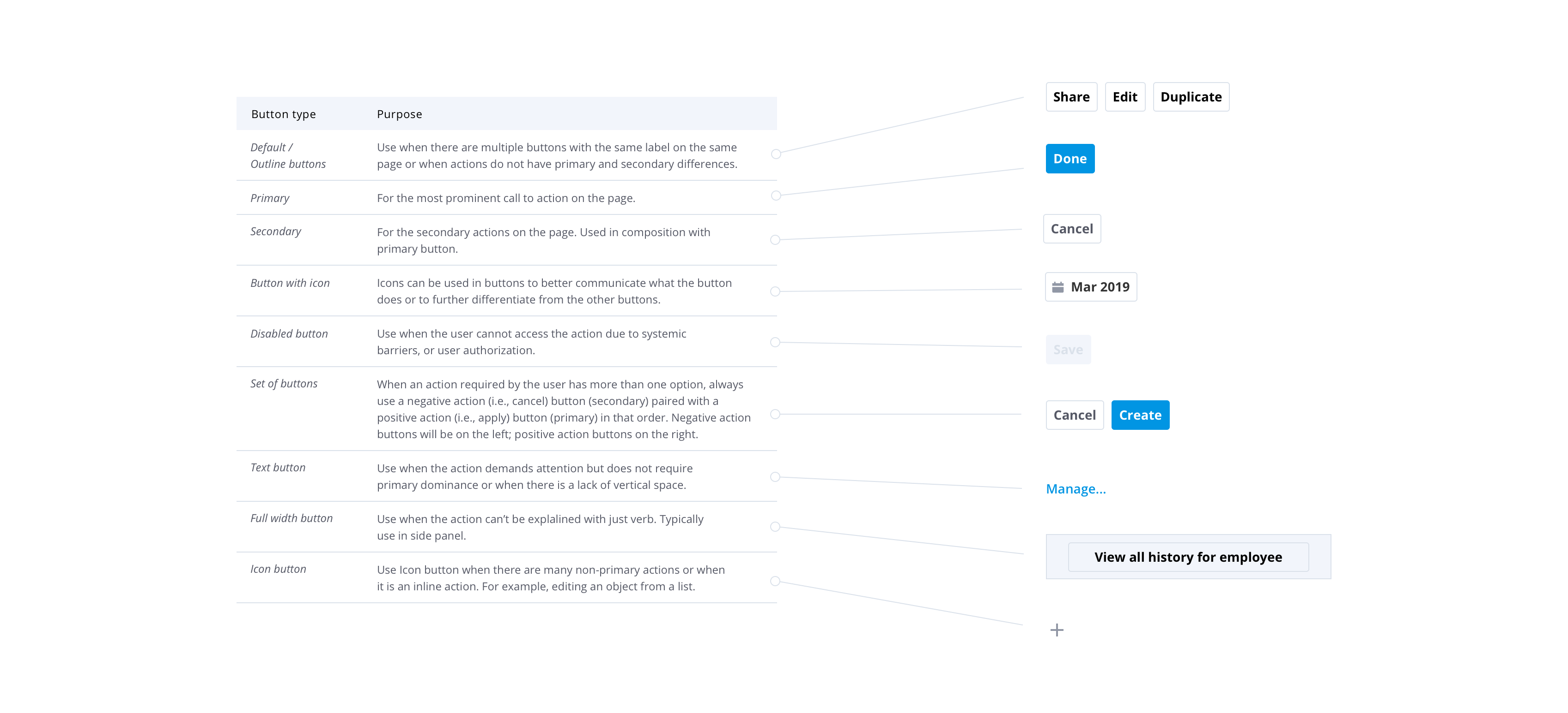
To effectively solve the issue, a development for a design system is essential. For this assignment, I’d conducted a thorough interface audit on the current product experience, primarily focusing on the button usage. From synthesizing with secondary research, I’d outlined on how Visier could approach and design using variations of buttons.
For more reference, here is an initial draft I made.
One of the most important lessons I learned at Visier is the importance of communication. For each assignment, I collaborated with many talented individuals with each of them having a diverse background. Everyone has different approaches to work and were enthusiastic about sharing their expertise and knowledge to the project. With a team dynamic that was constantly changing, coordination between the team members became essential to maintain performance and efficiency. When running into obstacles to innovate, instead of tunnelling myself into a loophole, I learned to reach out to my colleagues and my mentors for help. To my delight, collaboration not only sparkled inspiration, but it also helped reassuring project quality. As a result, I have now embraced co-creation as part of my working process regardless of different stages of design.